‘Sytt e sytt’ micro branding exercise
A simple, quick turn-around logo to adorn the labels of a hobbyist’s apparel brand.
Background
A good friend of mine wanted a logo to appear on the labels for her children’s apparel work that she was doing in her spare time. The brand name is a play on a Swedish phrase ‘Bytt e bytt’ (roughly: what is traded is traded). In this instance, ‘what is sewn, is sewn’.
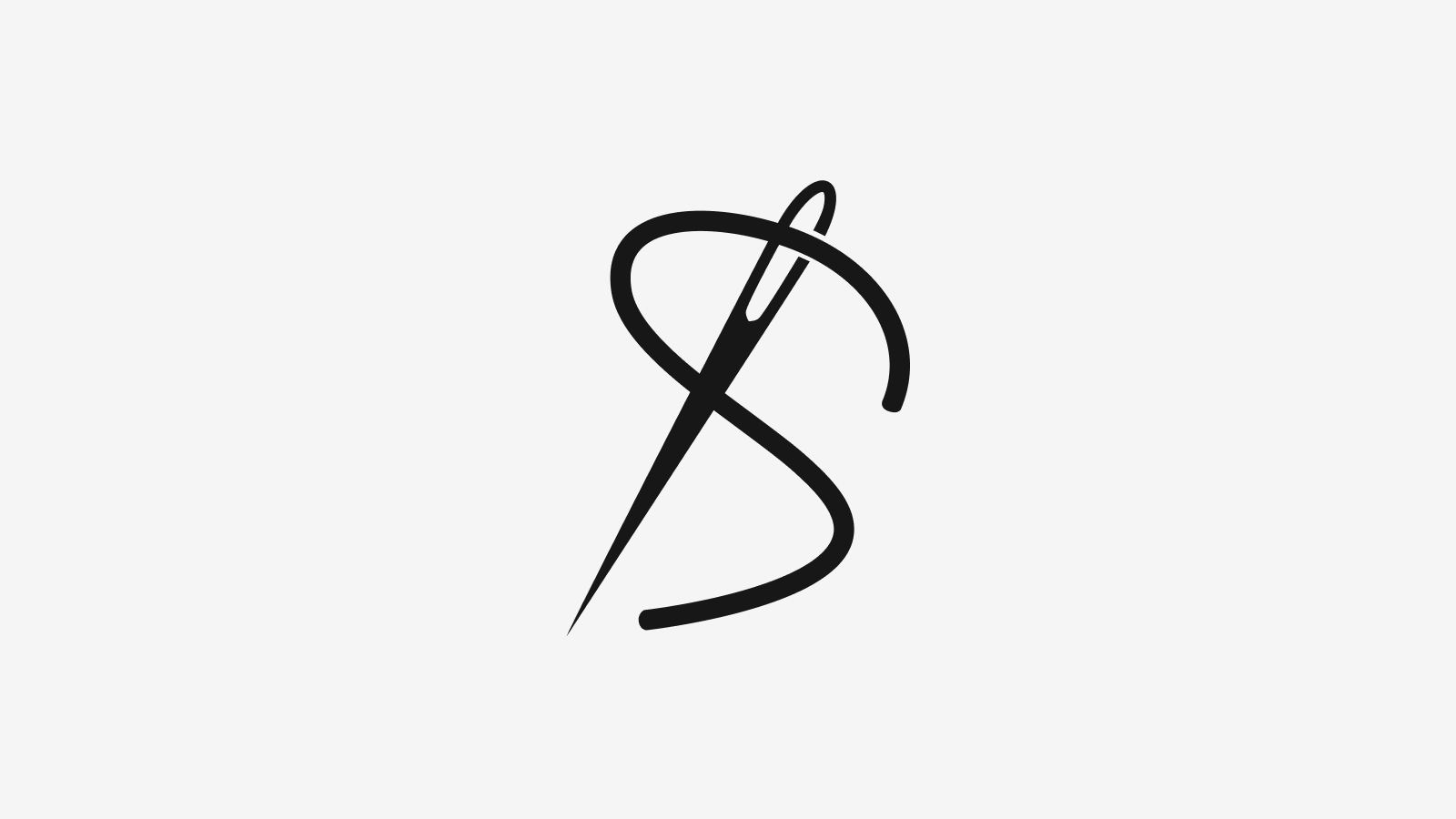
Logomark
The logomark consists of a simple thread running through the eye of a needle in the shape of an S. This is left fairly loose and informal, so as remain in keeping with the home-made nature of the apparel.
Typeface
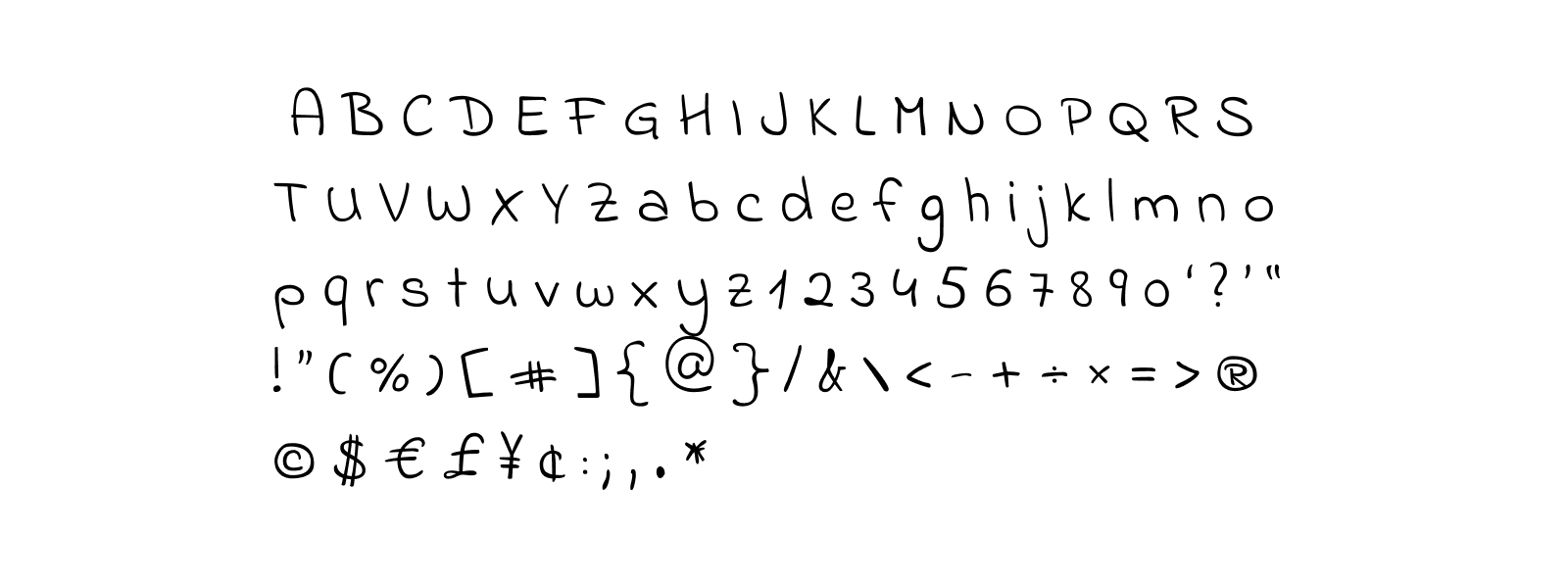
We wanted to continue the home-made and playful theme, and so we chose to use a typeface called Indie Flower, available freely on Google Fonts, designed by Kimberly Geswein.
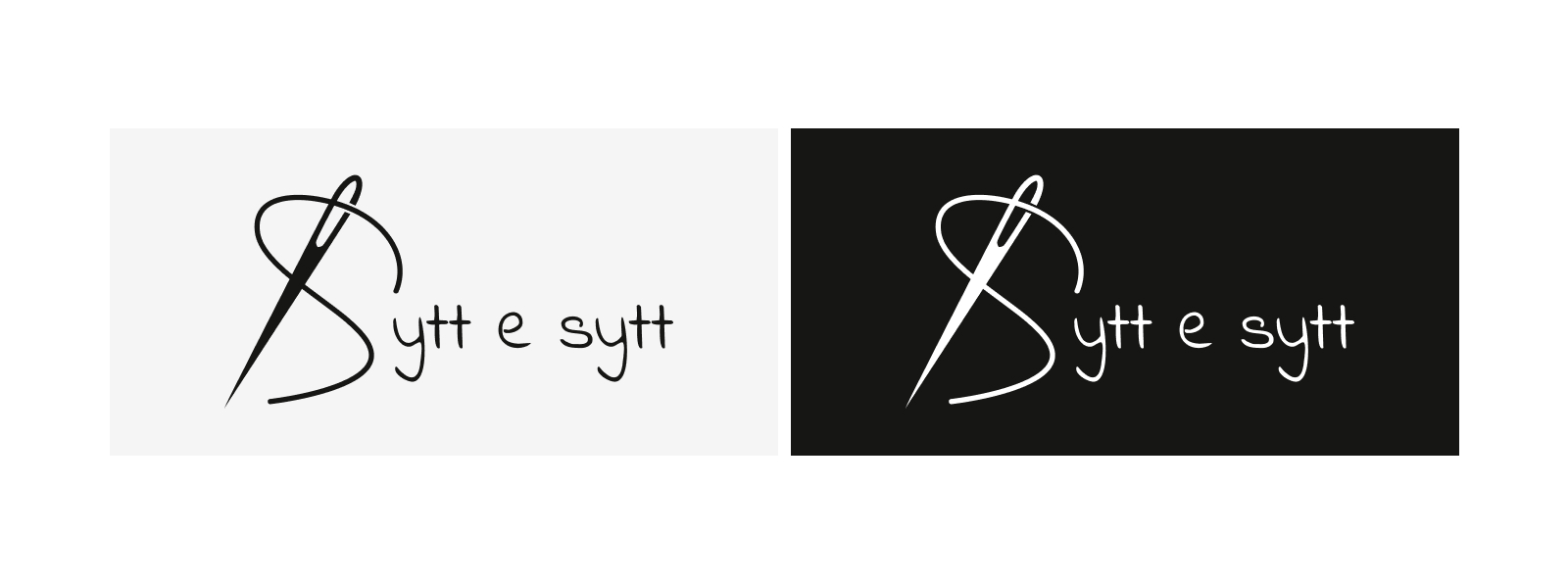
Combination Mark
Rather than use a separate stand-alone logotype, the S is dropped to avoid creating the impression of a double S and the need to section off the logomark.
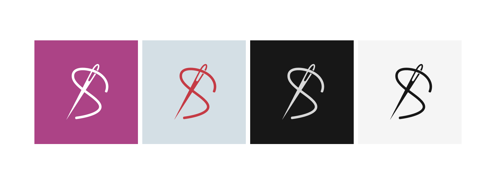
Honestly, I wish I could say that there are lots of moodboards and iterations to show, but we landed on something fairly quickly, and sometimes that’s OK. The logo consists of a couple of different weights, to allow for differing label sizes and to accommodate different fabric types and thread weights.
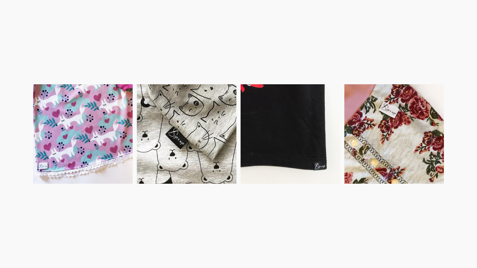
Sometimes small, fun, unpaid projects are a delight to work on and it’s particularly satisfying to see your work on something physical.