Graphics for a product launch event
Large format boards, vinyl wall and window branding for a launch event held an art gallery in Fitzrovia.
Background
In September 2017, TotallyMoney designed, built and launched the first iteration of its Free Credit Report service for new and existing customers. To celebrate the launch, and to generate a bit of interest, we took over an art gallery in Fitzrovia for a day, to act as a both a venue for an evening launch part for colleagues and partners, as well as a pop-up store during the day where passers-by could pop in and see what all the fuss was about.
My role involved producing some large posters to adorn the walls of the space, alongside a series of vinyl stat-bubbles and printed vinyl window decorations.
Little systems, big differences
TotallyMoney didn’t have any guidelines for print at the time of creating the foam boards, and so a key design decision early on here involved defining a quick layout grid to provide a little backbone of consistency across the posters.
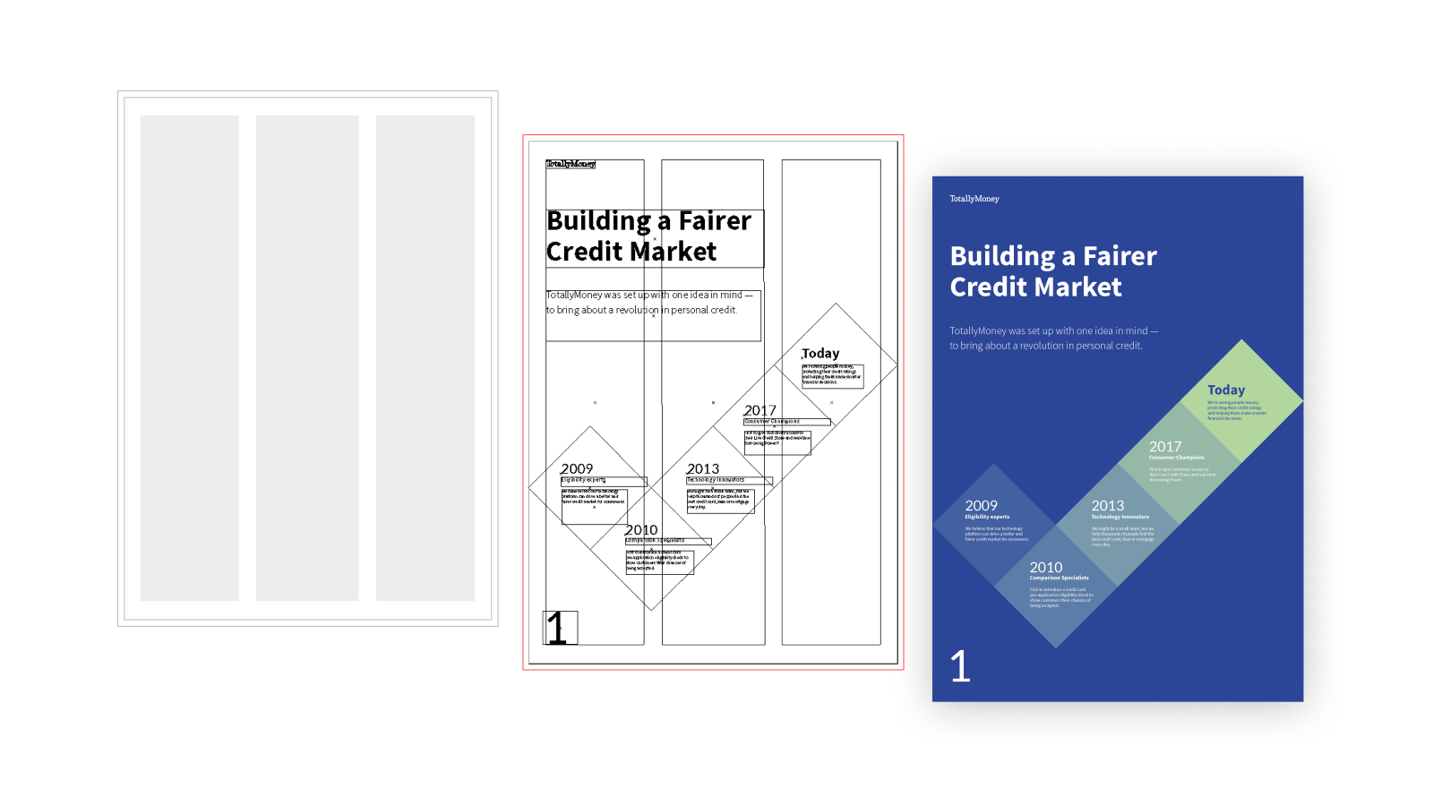
The general aim was to set up something minimal, that could be broken or changed up as per the needs of the content. Three columns with a healthy gutter allowed for some nice simple compositions that could vary and break out of the grid as needed.
Finding the right yellow
Yellow can be a difficult colour to get right in print, and as we knew we’d have a lot of yellow in our artwork it made sense to send a test page to the printer with a few variations. We wanted the yellow to print in as vibrant a tone as possible, without betraying the core brand colour we’d been using digitally. We were finding that the nice vibrant yellow in our brand palette wasn’t translating well to CMYK colour space, and so this was an essential test.
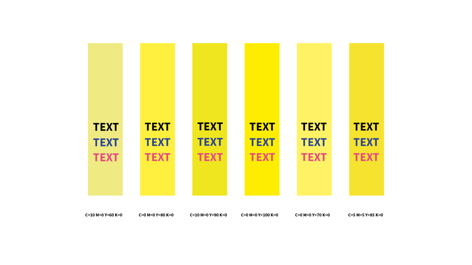
The yellow on the far left was our original yellow in CMYK, and appears quite washed out and murky. We sent this test sheet to the printer, who sent us back a printed version on the same material we’d be using for the final prints. We ended up opting for the second option, and we updated our artwork accordingly.
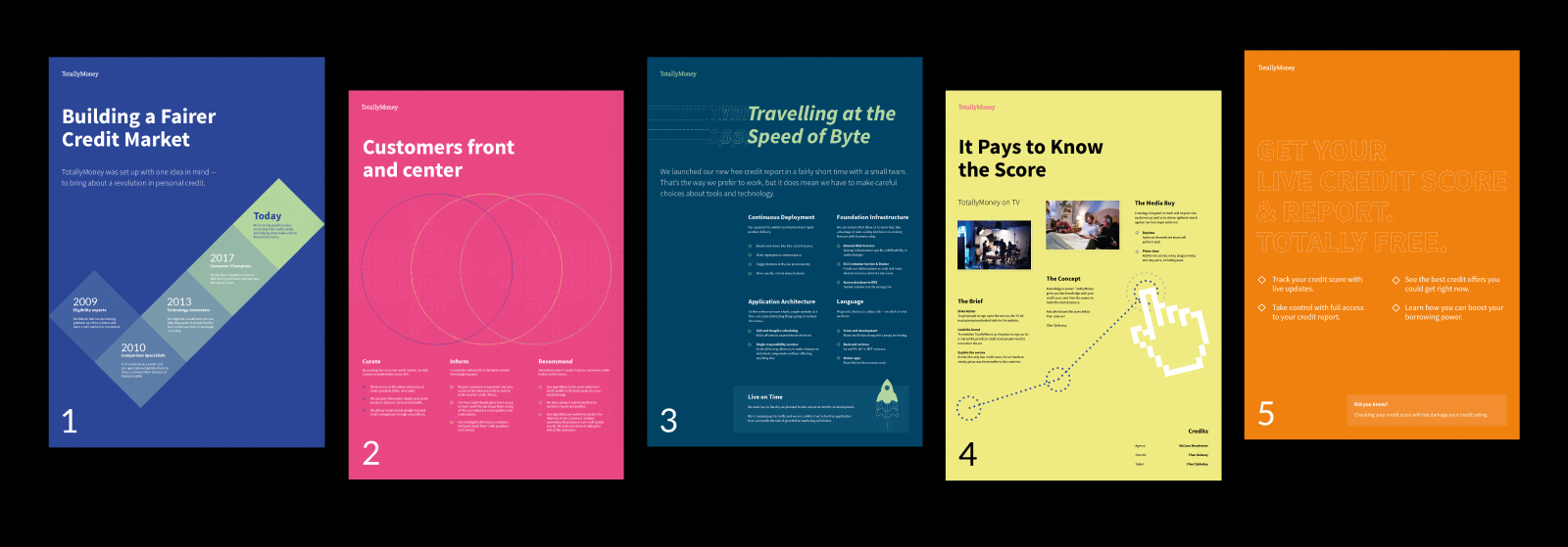
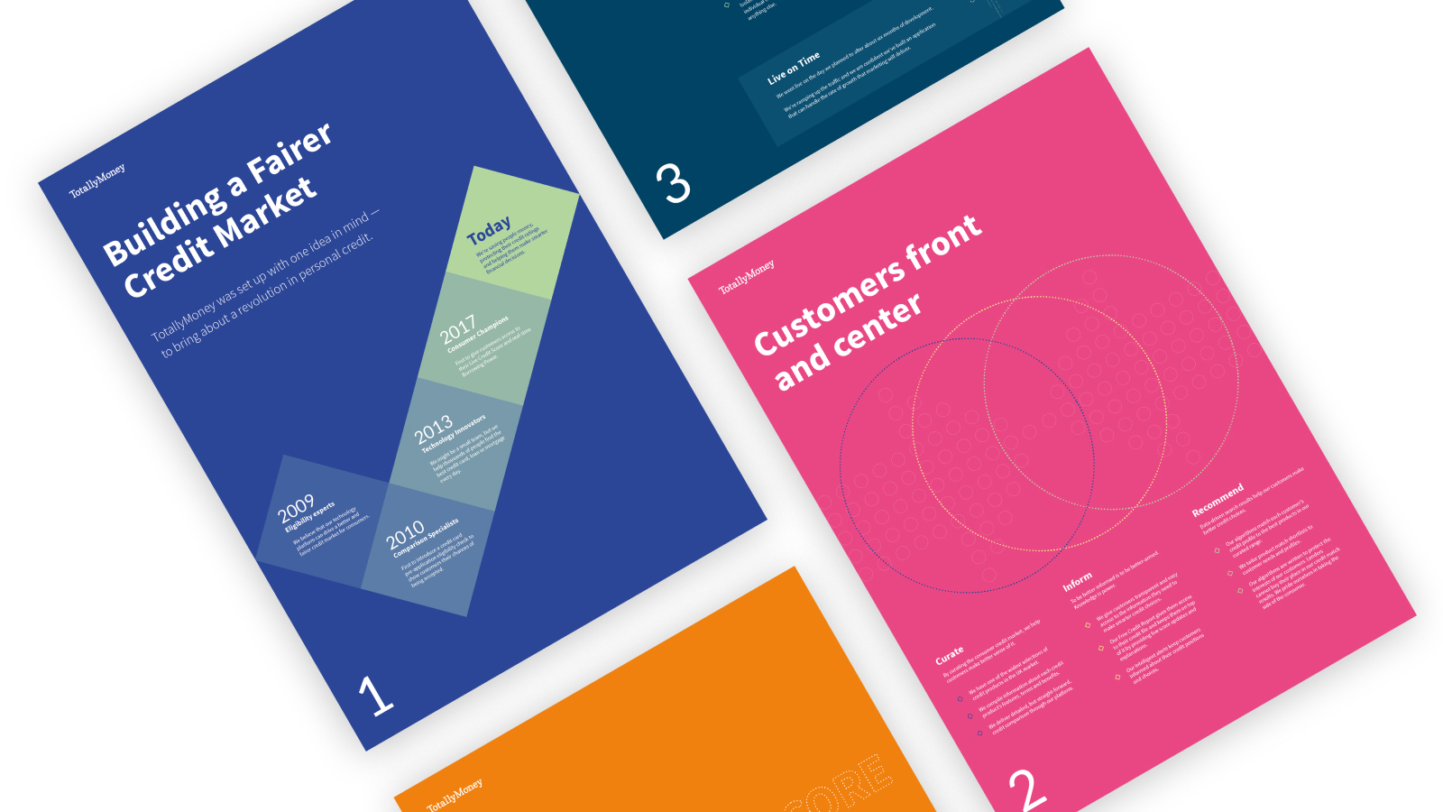
▲ Above you can see the final set of five foam boards created, with a mix of consistent elements and some graphical variations that aimed to tie in with the content on each board. These were a lot of fun to produce, and there is something extremely satisfying about producing graphics for print when the majority of your work tends to be digital only.
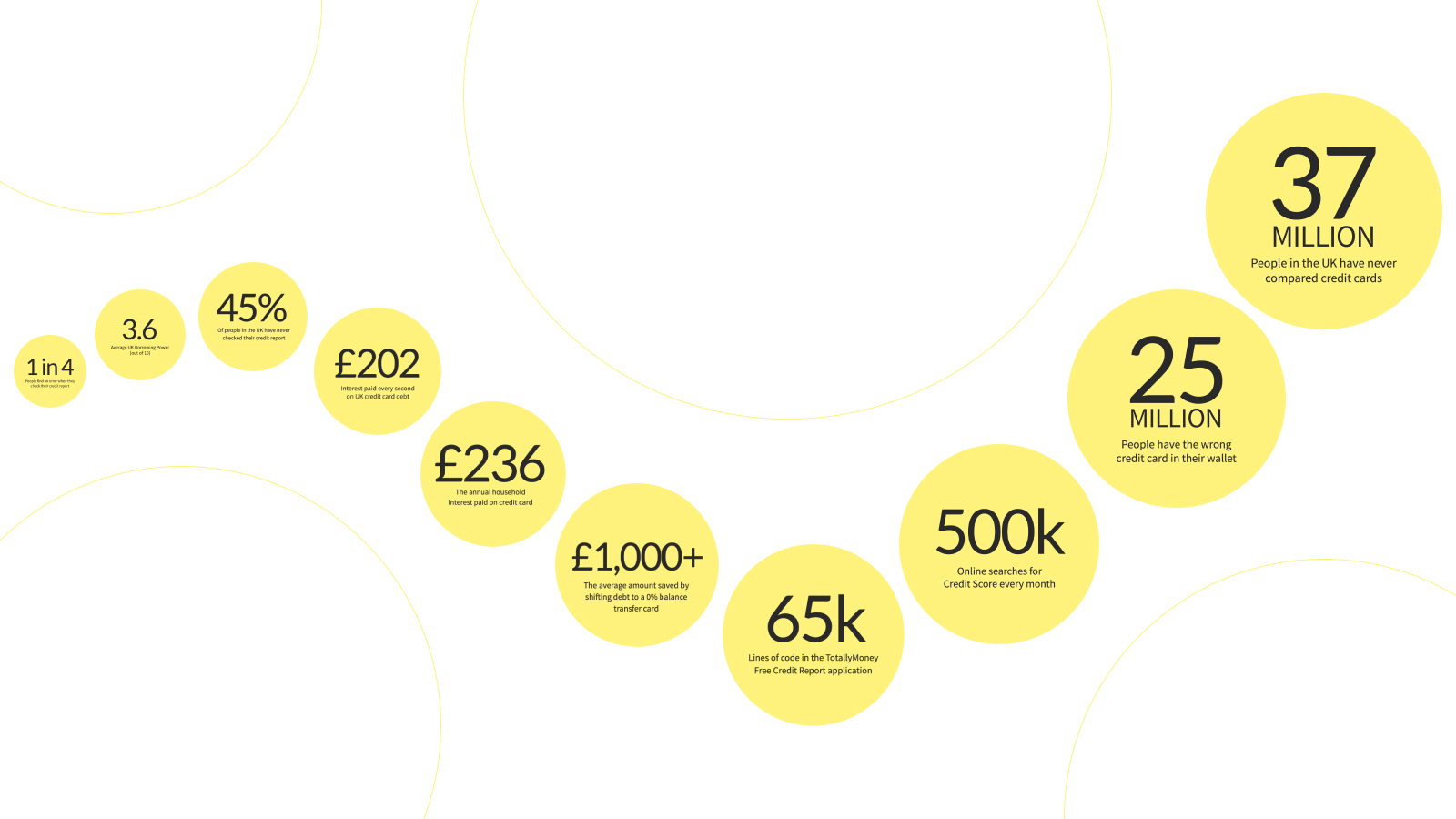
Below, you can see he sequence of vinyl wall decorations produced in ascending order depending on how large the number felt. These weren’t displayed at the gallery like this, but were printed at two different sizes and spread around the space liberally in order to try and help tell the story as to why what we were launching mattered. ▼
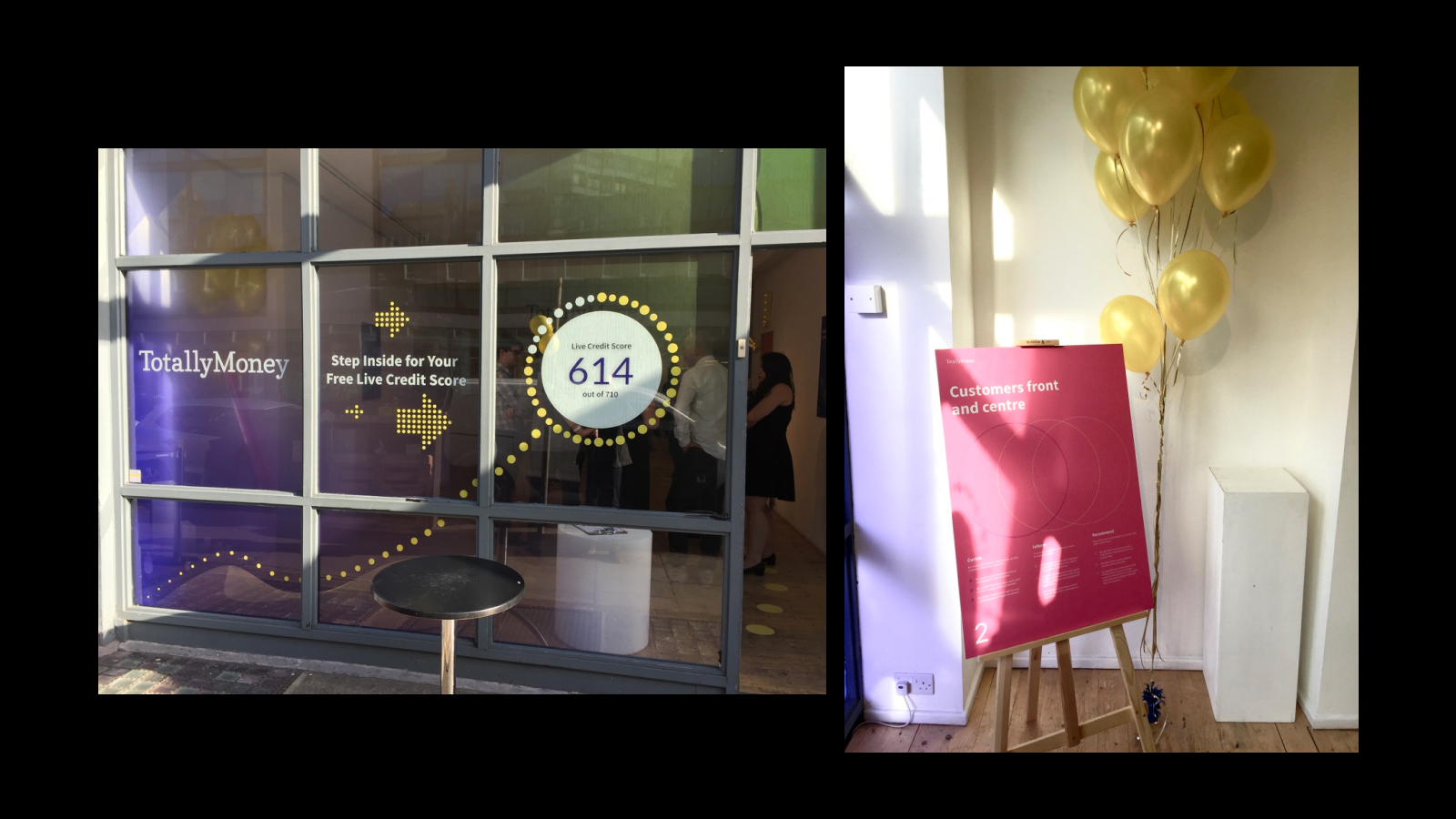
Window
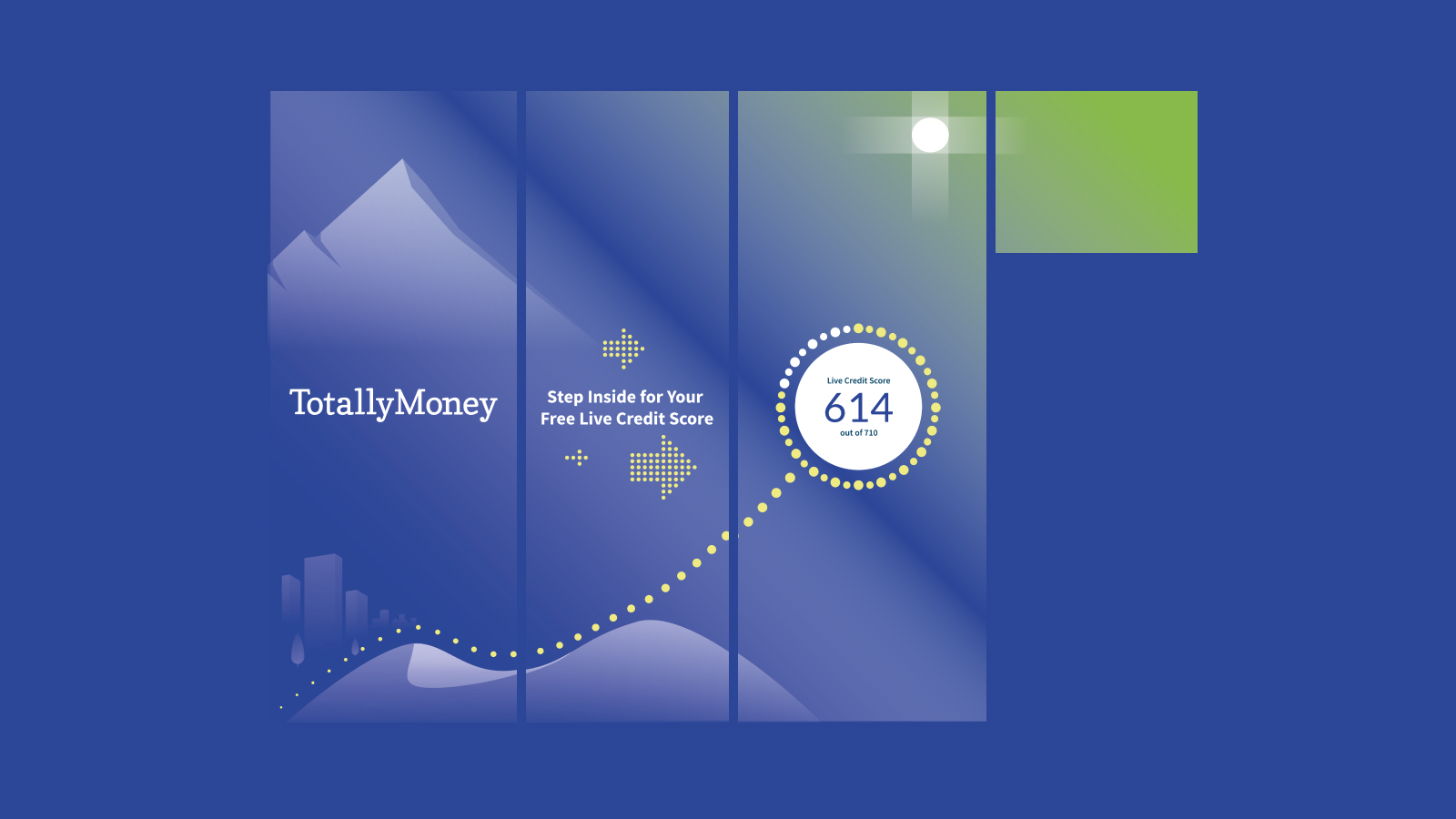
We were given the chance to update the front facing windows of the gallery with our own branding. As part of the pop-up activities being held during the day time we wanted to do something that encouraged passers by to step inside.
Rather than being a straight forward all-glass frontage, the window was split in to several smaller panes by a wooden frame. The design and subsequent artwork being supplied to the printer would need to factor this in.
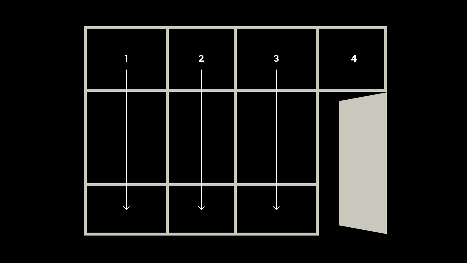
Through discussions with the printer, we decided to provide artwork in 4 columns, that could be cut horizontally to fit the panes in each column thereafter.
We ran in to some issues with some extra sealant being present around one of the middle frames creating some issues with the final alignment, however the final outcome was otherwise a success.