Gathering insight through qualitative research
A short research study aimed at helping to inform how a key customer touchpoint might be improved.

Background
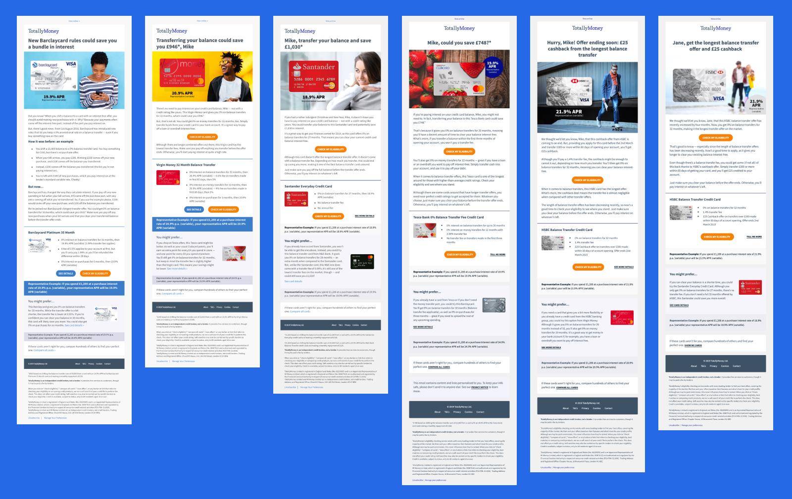
Throughout 2018 TotallyMoney made ~£1.2 million in gross profit from sending product alert emails to customers—who’d opted-in—providing them with the latest relevant offers from the credit cards and loans markets. However, during this time the content, structure, and design had remained largely unchanged.
There was a desire within the business to update and refresh the design of our alerts, to make them even better for customers as well as more performative from a revenue point of view. We had a lot of quantitative data we could look at (open rates, click through rates, et cetera) to help inform any design decisions we might make, however we lacked anything qualitative. In order to better understand what our customers thought about our product alert emails, we chose to conduct a brief research study to see if we could uncover some useful insight.
Why re-design?
We knew we’d not made any significant changes since we first introduced the touchpoint. From a performance marketing and business revenue perspective, everything was going well, but some nagging questions always remained in the background e.g. with the right approach, how might we unlock even better performance and improve customer satisfaction?
Instinctively, we knew we could achieve this.
My role
With the support and experience of TotallyMoney’s UX lead, I worked to plan, conduct and analyse a short research study that aimed to help TotallyMoney better understand what customers thought of the product alert emails they were receiving.
Objectives
We started by setting some primary and secondary objectives. We knew from our data that approximately 25% of customers who opened these emails would click through and the remainder would not. Digging in to why this might be the case seemed to be a sensible initial area of focus.
The primary objective was written out as follows:
We want to re-design our product alert emails, but need to do so from an informed position. To help us identify where we should prioritise our efforts, we should speak to our customers in order to establish why some customers click out and apply for credit from our product alert emails, and why some do not complete this journey.
The above was deliberately intended to be nice and broad, and sets the general direction of travel—the orientation—for a more detailed set of secondary objectives.
I won’t list all of the secondary objectives—a copy of the original planning document can be viewed here—however from a high-level point of view, secondary objectives were split in to various themes of inquiry:
e.g.
Content, visual design, customer expectations
Within these themes, we could pose various questions that we’d like to get some answers to:
e.g.
How does the customer feel about the tone of voice used in the copy?
What is the most important information in the email?
How often would the customer expect to receive such an email?
Sourcing the right participants
As this was to be a short initial study, we opted to conduct the research in a remote, unmoderated context via UserTesting.com, that provide some useful built-in tools that allowed us to source the best possible participants.
Demographic
For security and data protection reasons we weren’t in a position to make use of our existing customer database, but we wanted to ensure that participants matched, or closely resembled customers in one of TotallyMoney’s key customer segments. The following would therefore needed to be true:
- To ensure market familiarity — participants must have engaged in the credit marketing in the preceding 12 months in some form.
- We knew that our traffic from this email was very heavily skewed towards mobile users at approximately 80%, and so we wanted participants with a similar likelihood of being on a mobile device.
- Participants must be from the UK.
- Participants should ideally be in the £10—£25k income bracket.
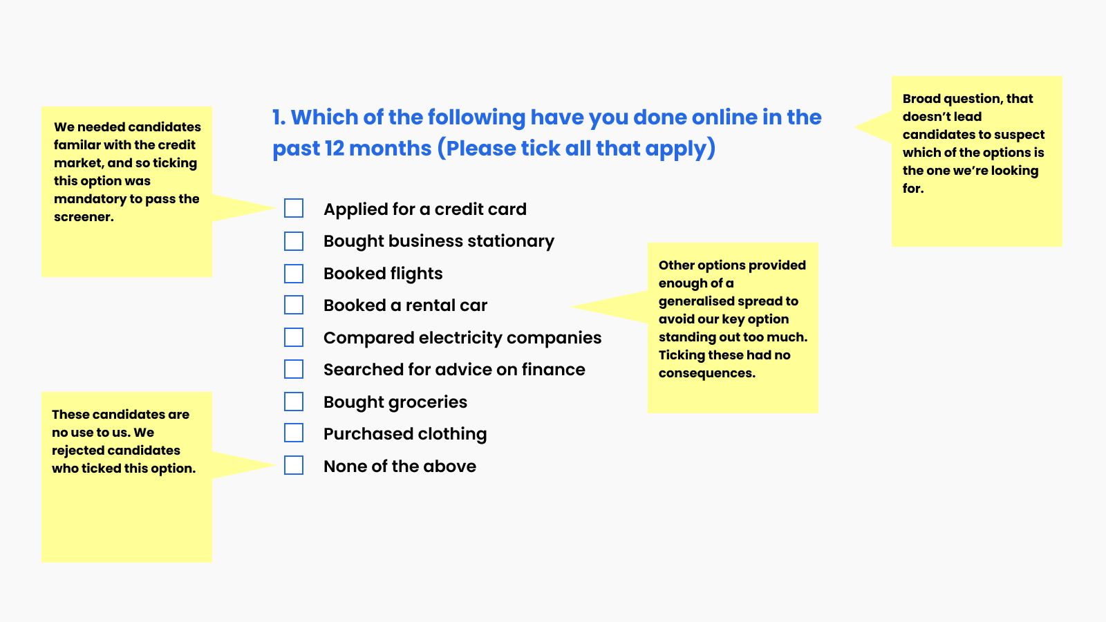
Screener
UserTesting.com allows some of the criteria mentioned above to be applied as a filter. Beyond that, we screened participants by posing some initial questions up front.
When doing this it was important to set the questions up correctly. We wanted only the most appropriate, genuine participants to pass the screener.
Prototype
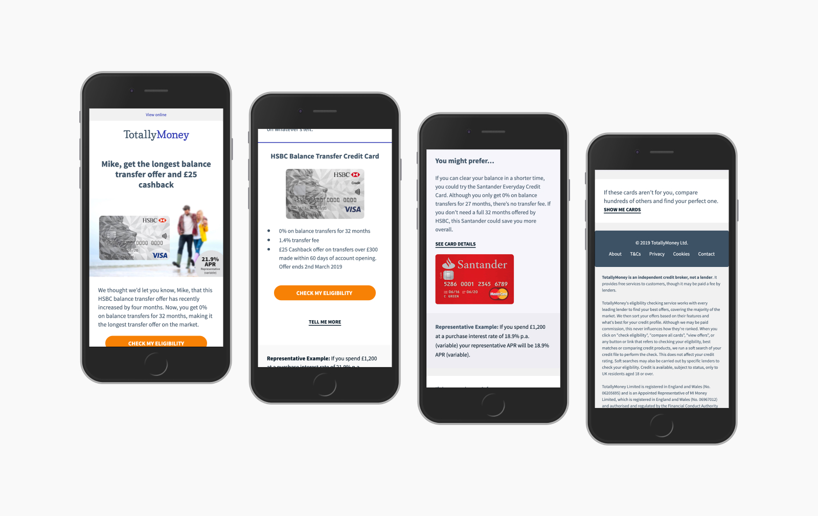
One of the more interesting aspects of this study was that we needed participants to respond to an email touchpoint.
We weren’t in a position to send an email directly to participants, but wanted them to experience the email in an inbox-like setting. Furthermore, we wanted participants to experience the email in a way that was responsive to their device size, as opposed to some idealised version. We opted to send participants through to a browser-based demo email, that acted as the closest match we could get to proving a real inbox experience in terms of visible area and responsive behaviour.
Script
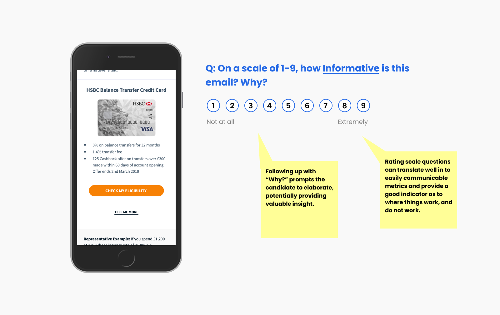
As this was to be an unmoderated, remote study, participants would be interacting directly with a set of tasks via the UserTesting.com app. Each scripted question made varied used of UserTesting’s range of question types, focusing largely on simple prompts to get the candidate talking mixed in with some rating scale questions in an attempt to provide some basic metrics we could look refer back to.
It was important to us to respect the time of our participants and so we wanted the study to be light on hoops to jump through, albeit with space to allow participants to elaborate if they wanted to.
A draft version of the script can be viewed in the planning document mentioned previously.
Analysis
Once everything was ready to go, we launched a pilot of the study to see if there was anything we needed to adjust. Once any adjustments were made, we launched the study with an additional four participants, bringing us up to five, which we eventually extended to ten participants. Once we had our ten, we could play back each study and begin the process of analysing the responses.
Theme spotting
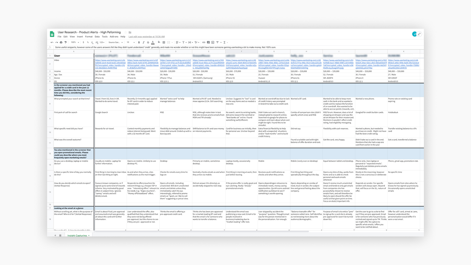
UserTesting.com allows for videos to be watched back and annotated in real-time. However once all of the notes and comments were added, they were transcribed in to a Google Sheet with questions in the Y axis and users in the X. This proved to be a great way to quickly scan through each area of interest for us, enabling quick identification of key themes and patterns.
From the initial analysis, a couple of of the key themes that appeared were:
- Approachability — participants seemed to respect the tone and approach of our content.
- Length — participants thought the email was thorough, well structured, but perhaps too wordy.
Beyond key themes, we were able sift through the findings and create an initial analysis that communicated key takeaways. These were written up and matched against each section of the study, along with links to a highlights reel of key moments as spoken by the participants as corroboration. We also looked back at the initial objectives to see if we had achieved what we were looking for.
Next steps
The immediate next step involved taking all the findings and putting it together in a format that could be easily presented back to the team and other stakeholders, so a plan of attack might be put together as to how to tackle implementing or testing any recommended changes.
Full disclosure: I wasn't able to complete this stage of the work. As my time at TM drew to a close, I paused further work on this project to prioritise wrapping up elsewhere.
Areas for improvement
- One of the problems inherent in conducting a study in this manner is that the participants weren’t our customers. They didn’t know who we were and therefore lacked some of the context needed. We tried to address this in our script, however we probably didn’t go far enough, and could do a better job of priming the candidate from the outset.
- Our study involved a single email, and yet in a real setting, the journey to and from the email might have multiple steps, including push notifications, interstitial screens, email apps and an onward journey through to a potential credit application. Looking at the email in isolation was useful for this small study—that’s what we were focusing on after all—however it’s possible looking at the email in isolation altered how it was perceived. In particular, email subject lines and preheaders are critical performance-influencing elements and so perhaps these should have been included in some form.