Acquisition Journey for Fluid
Re-launch of the customer acquisition journey for Fluid, a credit card brand for people with lower credit scores who want to reduce interest payments on existing debt.
Background & Role
TotallyMoney launched the Fluid credit card in the early 2010s in partnership with MBNA as one of the first credit card brands to offer ‘eligibility checking’. After a successful initial run, financial services company NewDay took over as partner, and were keen to quickly re-launch it with a light-touch brand refresh in early 2018.
I joined the project after an initial draft of the new brand guidelines had been completed, something that was worked on in collaboration between our Head of Brand and an external agency.
The team consisted of Head of Brand, Product Manager, Lead Developer, Front-end Developer, Commercial Manager, and myself.
I was responsible for adapting and extending the brand guidelines for use on the web, rapidly designing and assisting with the build of the new customer acquisition journey in alignment with in-house best practices, and creating the beginnings of a common design language that could be shared both internally and externally.
The project was ongoing over 1-2 months, juggled alongside other work.
Key Design Challenges
Handling only part of the journey
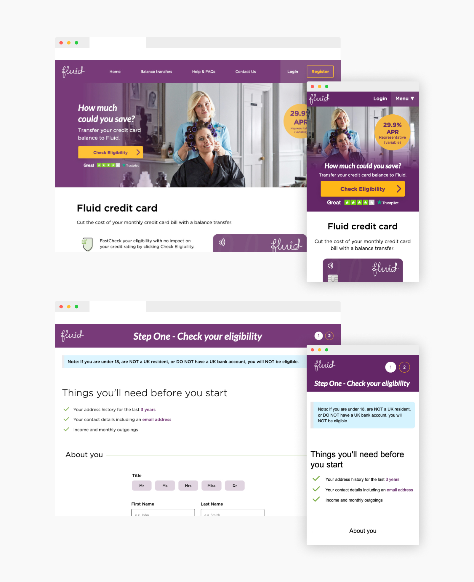
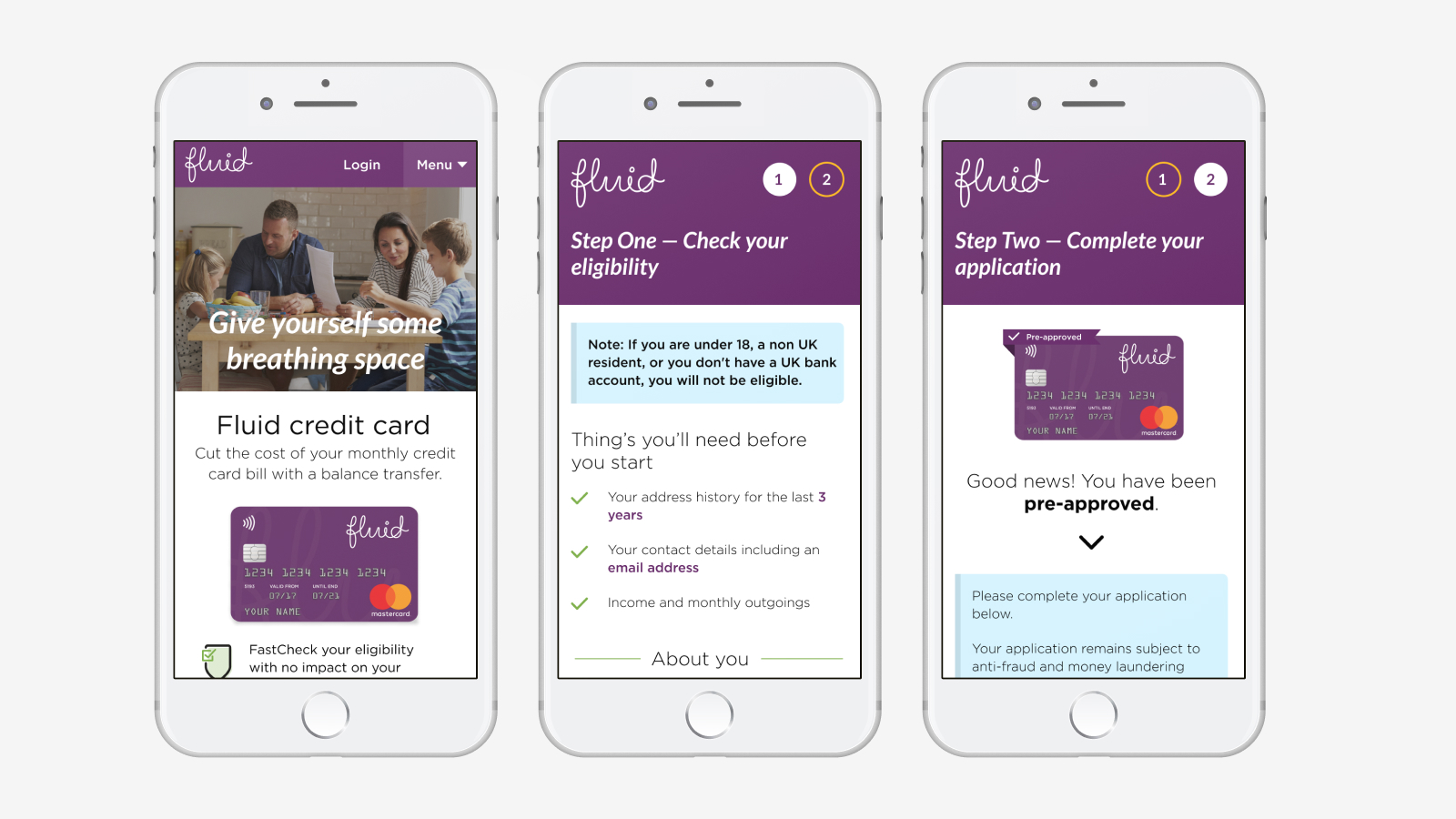
We’d be creating only part of the overarching customer journey. We’d acquire the customer via various marketing efforts and would guide them through the initial decision to apply, through an online form that checks their likelihood of being accepted, before handing the customer—and their data—securely over to NewDay’s ‘side’ of the app for application completion, and decisioning.
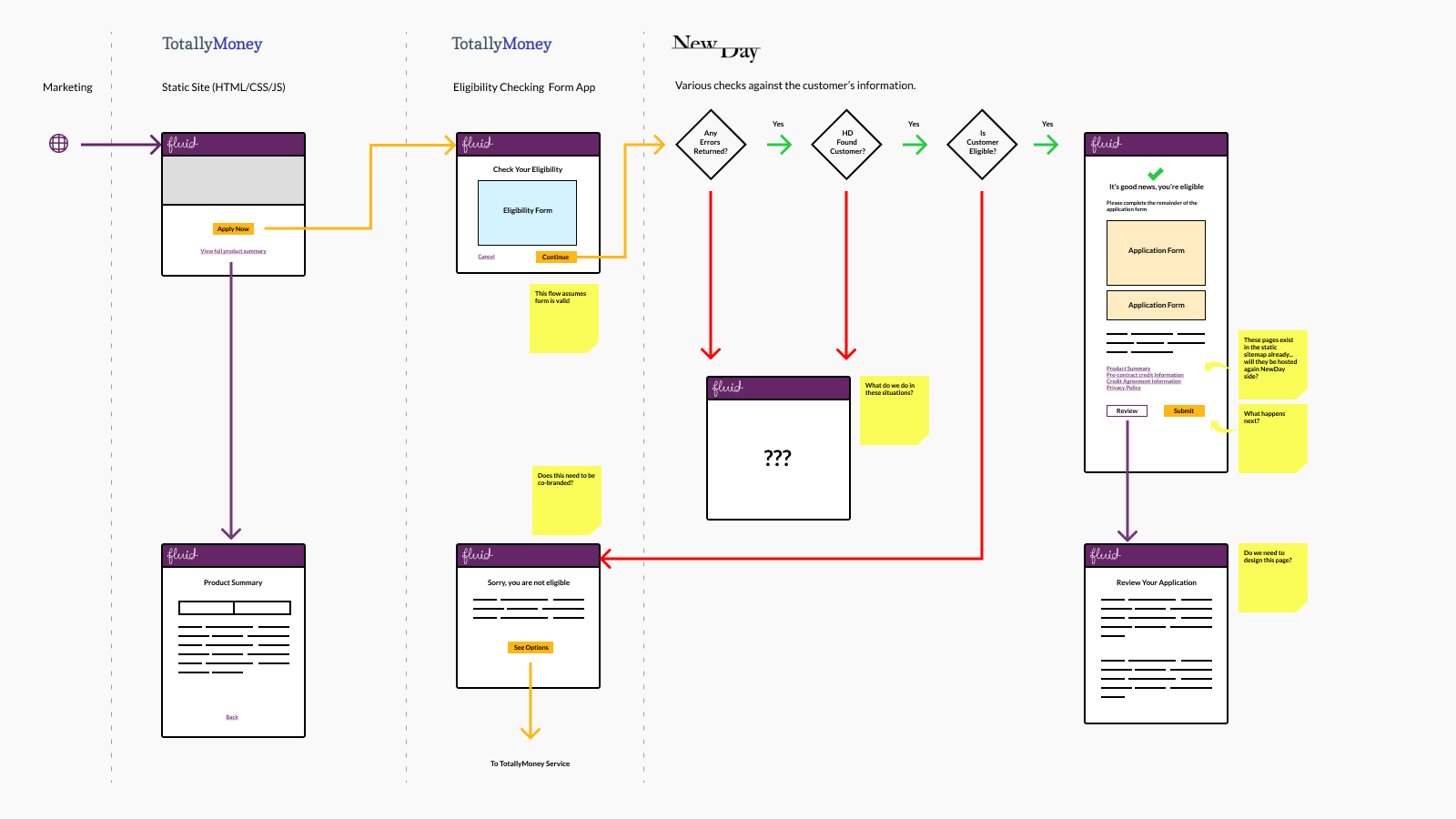
The journey we were creating was fairly simple, and something we were highly familiar with from previous projects, however in this instance the combined splitting of technologies and responsibilities made it worth plotting things out quickly to make sure we knew exactly what was in scope for our team, and to identify some areas we needed to question. This helped the team identify application views we might need to cater for, or prompt NewDay to tackle.
Quickly creating a usable styleguide
We needed to come up with a simple and effective way to reduce the risk of inconsistencies between each ‘side’ of the experience for customers. Using the starting point of the draft brand guidelines, we took the decision early on to use Sketch + Sketch Cloud as a light-touch way to document the key decisions we were making for sharing with the team at NewDay.
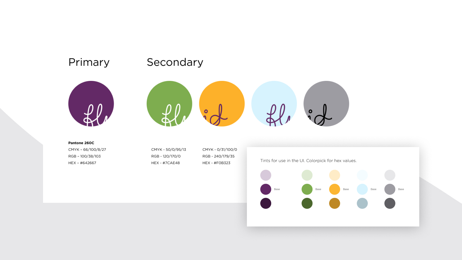
We adjusted the original colour palette to give us a few more options to play with, which we then extended further to allow scope for things like button states in the UI. We didn’t expect the colours to be used in print, however we did need to ensure the primary brand colour was derived from a Pantone, as this would be become the colour of the physical credit card, with CMYK variants for the secondary colours just in case.
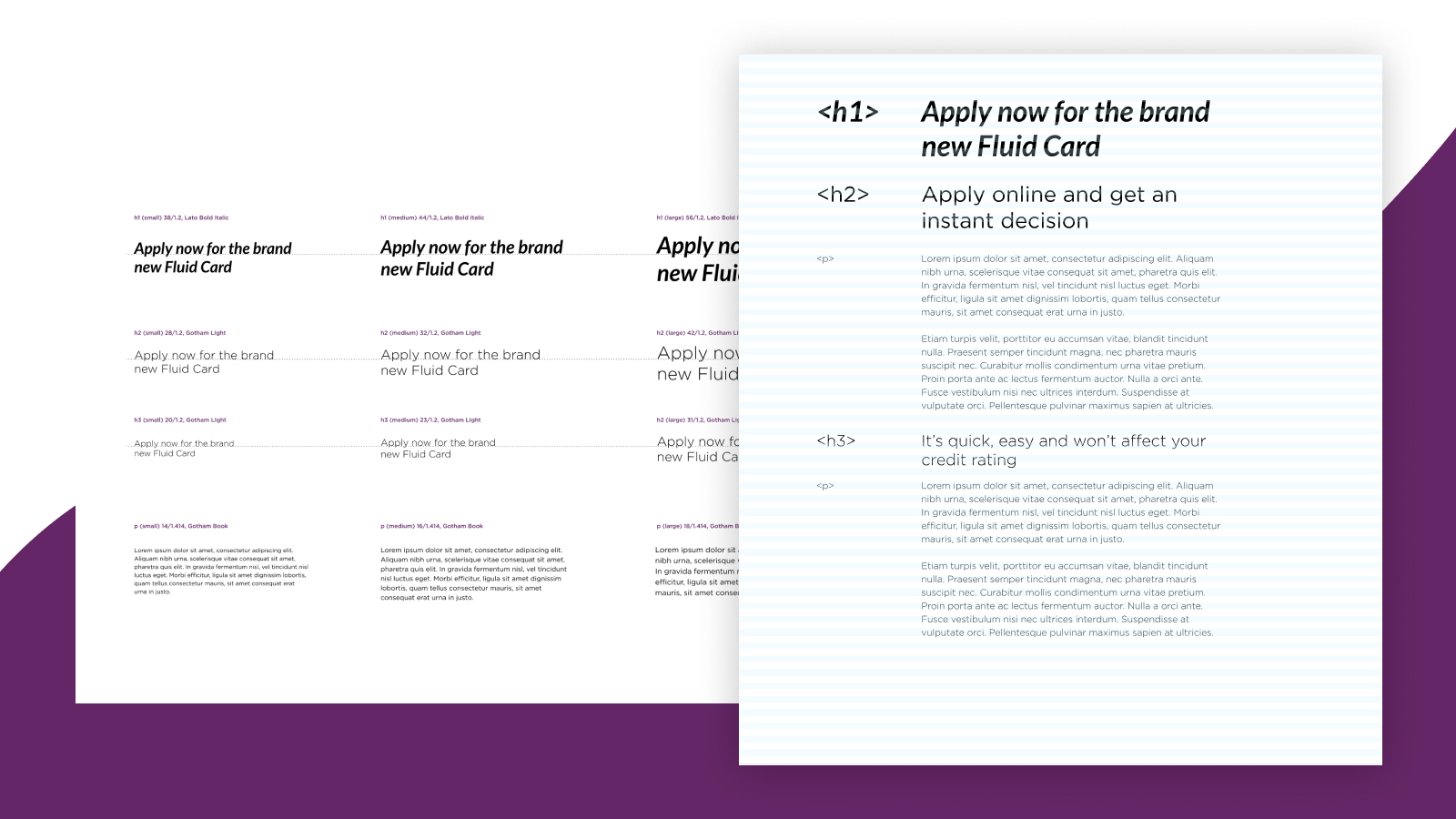
We described some basic rules for typography, including a vertical rhythm based on a fairly simple, common sense scale. Sizing variation were described for small, medium and large breakpoints to ease things along further.
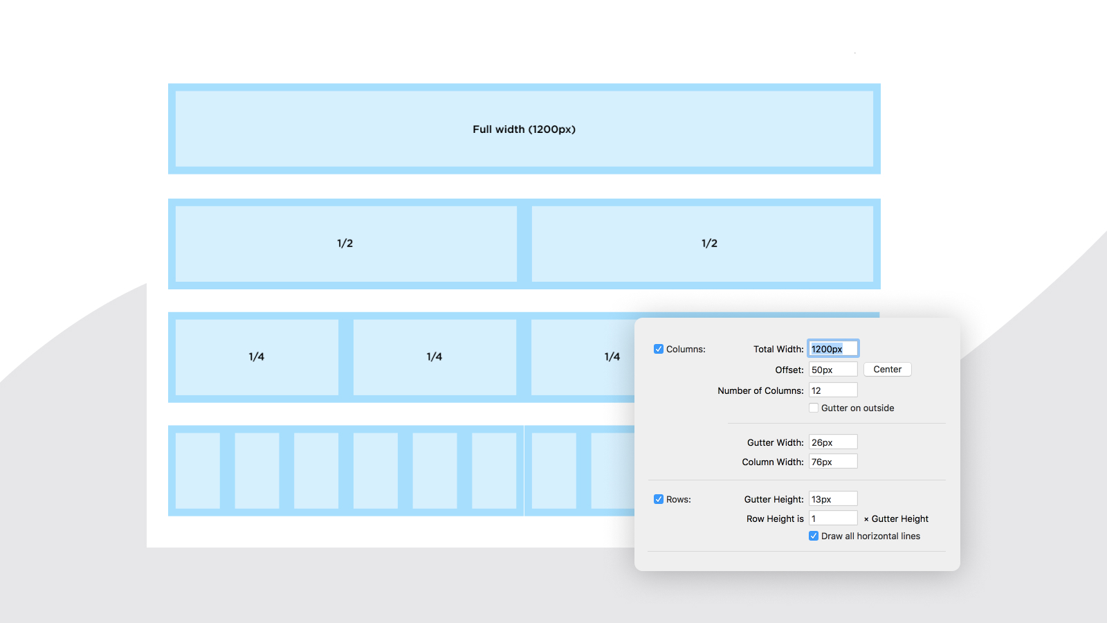
A simple layout grid was also provided for consistently spacing layouts on larger breakpoints. This wasn’t intended to be followed slavishly, but used as a loose guide for designers on the NewDay team when mocking up new views their end in Sketch.
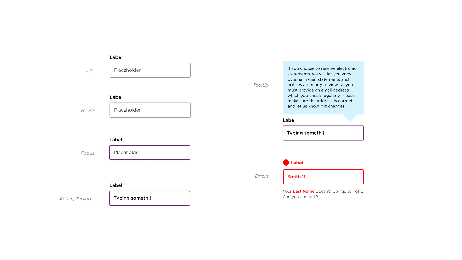
As we’d be creating a web form for prospective customers to complete, we needed to lock down some style rules for input elements early on, including a fairly typical range of states. The team at NewDay could start mocking up things their end as soon as we shared our initial designs, as well as provide feedback related to anything they needed that was missing.
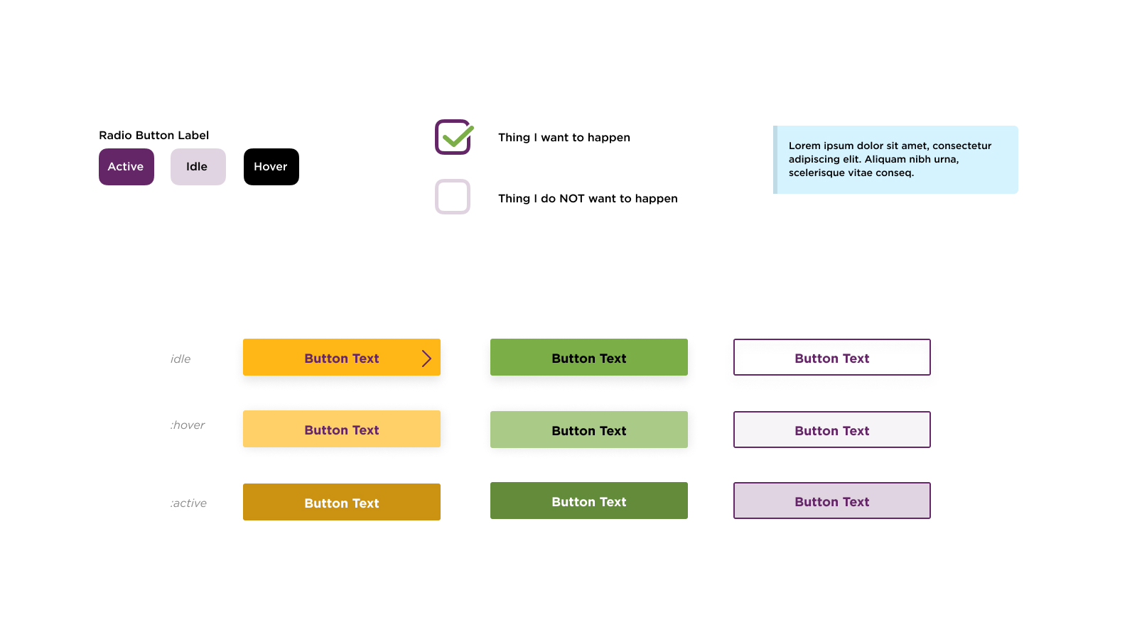
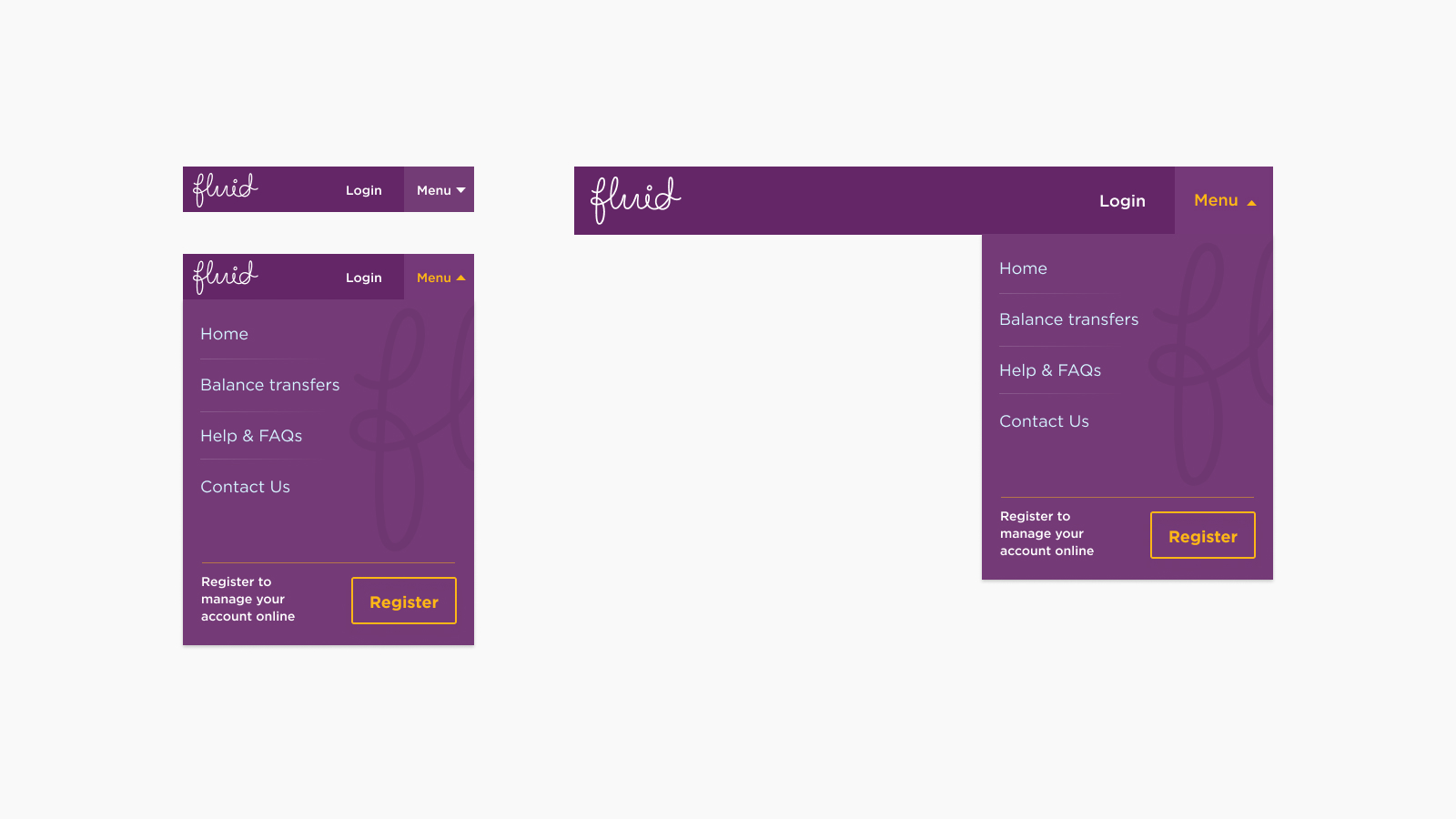
▲ Naturally, we also needed to cater for form inputs of various types, from radio buttons through to check boxes, buttons and informative callouts.
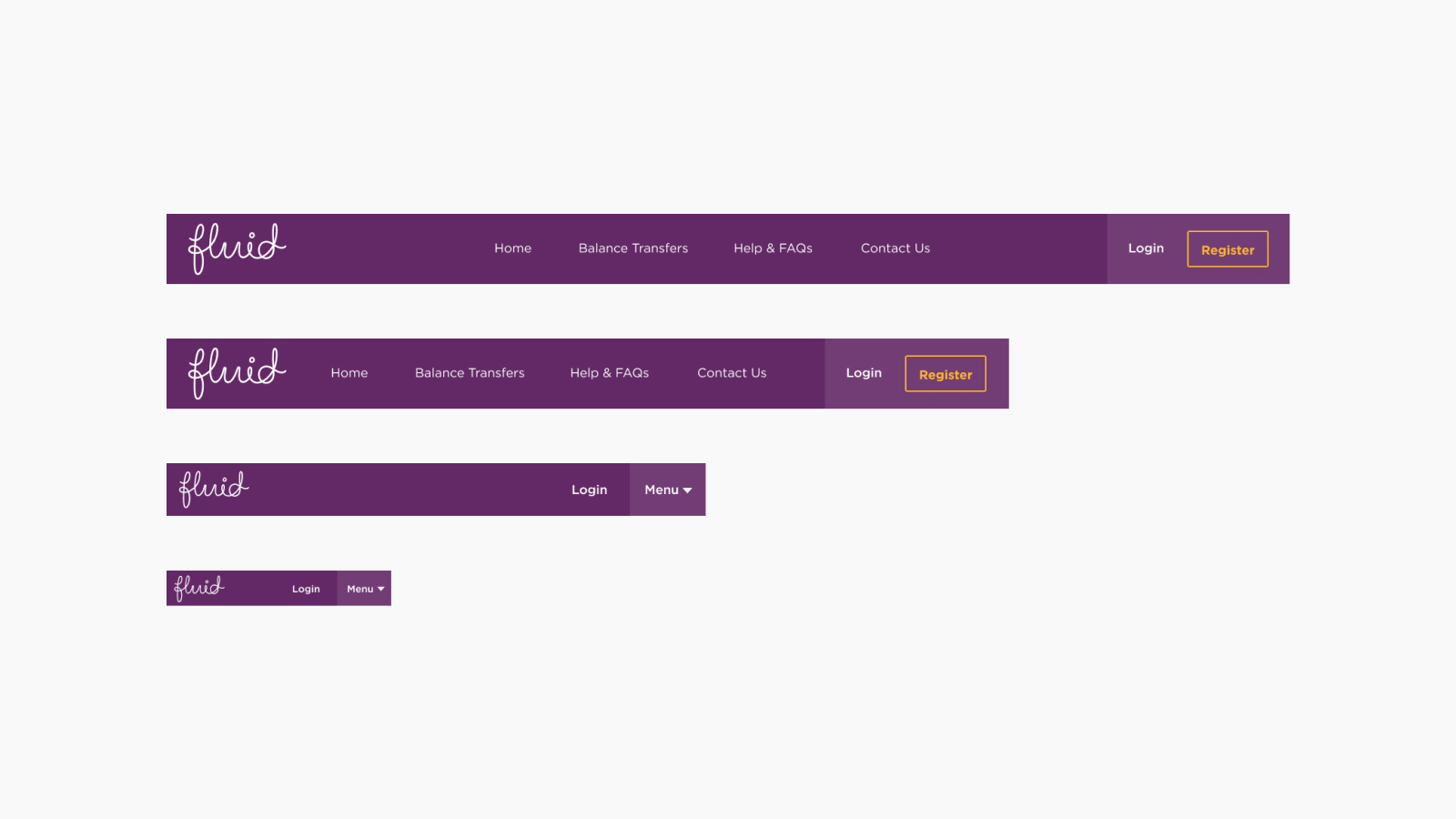
One of the core components that would span the entire customer journey was the site header and navigation, and so we decided to cater for this early too, providing a design at multiple breakpoints.
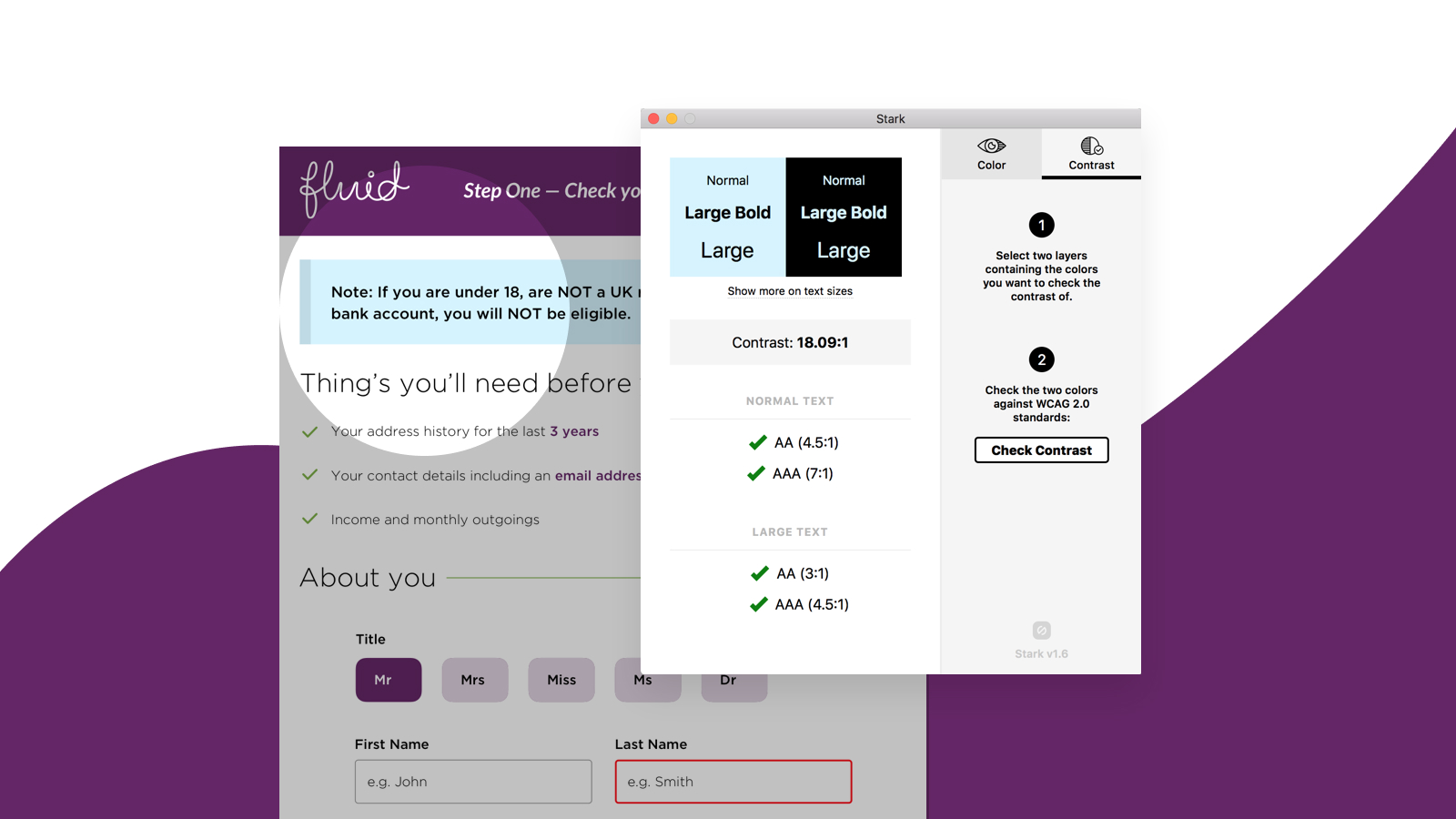
We’d been asked to make sure the parts of the journey we were creating adhered to AA accessibility standards. Getting accessibility right is hard, but one of the ways we aimed to make life easier from a visual design point of view, was to use a tool called Stark—a plugin for Sketch—that would allow us to check things like colour contrast as we went along, and was also something the partner team at NewDay could easily setup too. ▼
Dotting the i's, crossing the t's
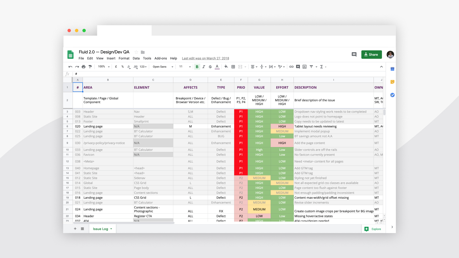
As our launch date drew closer, we wanted to create a simple place to prioritise and log all of the last minute fixes or enhancements in as low maintenance a way as possible. Rather than run everything through a tool such as Jira, we created a Google Sheet, shared amongst the team, where we could very easily add things to, as well as prioritise and assess the effort VS value of each task. By working in this way, we were able to rapidly work through a large chunk of last minute tasks.
Additional Visual Development
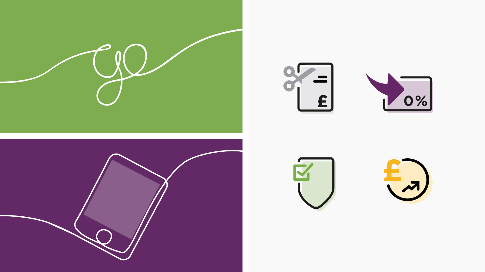
Alongside the work already mentioned, there were some gaps in the brand materials in terms of iconography and illustration and so we created a few additional illustrations, as well as an initial set of four icons to represent some key messages. Illustrations, as per the brand guidelines, needed to consist of a single unbroken line running from left to right, exiting the canvas higher than the entry point. For the icons, we had nothing to reference. The unbroken line treatment wasn’t appropriate for iconography at smaller sizes, and so we opted for a more traditional approach.
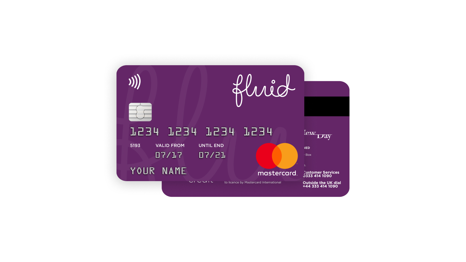
We also needed to make some adjustments to the proposed card design. Adjustments to the primary brand colour, and layout tweaks to various graphical elements were needed in order to arrive at a balanced, friendly looking card that echoed what the brand was trying to achieve.
In Summary
Overall this project was a great learning experience. Myself and the team were launch-ready ahead of time, having created an accessible set of acquisition touchpoints rapidly, whilst ensuring our design decisions were shared and collected together in one place to facilitate closer collaboration with an external team in as hands-off a manner as possible.
There is always more than could have been done to improve the experience for customers. We would have liked to spend time on adding some additional polish via motion design, iterating through page designs, messaging hierarchy, and testing different options in front of real customers in advance of launching, however this wasn’t in scope in this instance, something that was acknowledged by all stakeholders.
Post-launch, the partnership with NewDay had contributed almost £2m in 2018 to TotallyMoney’s revenue, of which Fluid played a major part.