Design + Build
Designing a content portal to help improve market liquidity
4 min read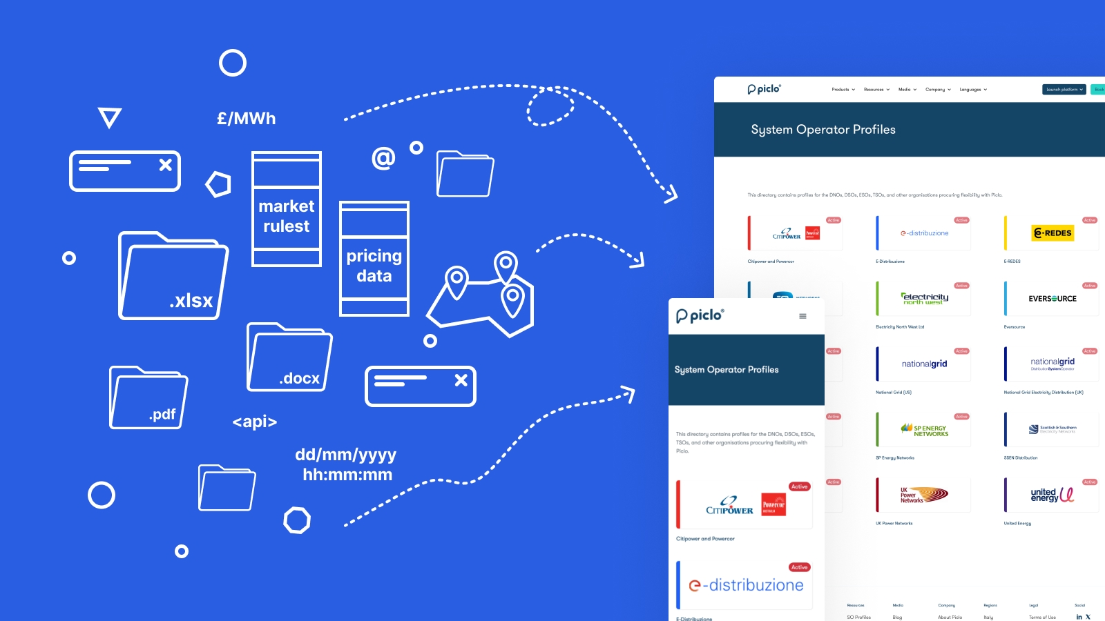
Summary
Over a two week period, I designed and implemented a Webflow-powered content portal that enabled Piclo customer support to work together with external partners to centralise and standardise how market information was distributed and presented to end users, including support for multiple languages.
What worked
- End-users only had to visit one location to get the majority of the information they needed.
- We built stronger relationships with key business partners.
- Customer support were empowered to manage this work with minimal design and zero engineering input.
- We were able to scale this added-value to more partners globally—localised to their region—for existing orgs and those in our sales pipeline.
Key lessons
-
We underestimated the time-burden managing this content would become for our internal team. This later lead to us forming a squad with colleagues from across the business who shared the upkeep responsibility.
-
Our post-launch analytics showed positive usage spikes during periods of high market activity, yet we felt overall usage was lower than anticipated. This lead to a mindset shift away from building a knowledge repository towards the solution being an engagement opportunity.
My role
- Solo end-to-end design and implementation
- Co-ordinate internal team to ensure feasibility
- Onboard external partners to set and manage expectations
- Train internal team to manage things going forward
Problem
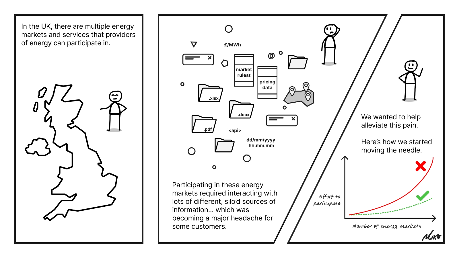
From evidence gathered via qualitative research, we learned users were having difficulty locating and parsing all of the information they needed in order to effectively participate in flexibility markets on Piclo Flex. Typically, each market operator would host important information on their own web platforms, often with differing terminology, processes, information architecture, and experience quality.
This created additional friction and work for users, as they had to keep track of data and information that lived in several different places and was simply not consistent.
This formed part of a broader wicked problem, and was raising the barrier to entry for lots of smaller businesses that didn't have the resources to navigate this complexity. This had the overall effect of harming market liquidity.
At Piclo, we didn't have the internal resource to take on this problem entirely, but we felt as though we could begin moving the needle.
Opportunity
- Chance to begin moving the needle on a wicked problem that was aligned to our business mission.
- Chance to lower the burden for users on both sides of the marketplace
- Chance to improve participation and therefore market liquidity
- Chance to improve relationships with market operator customers
Constraints
- Tightly time-boxed, two week end-to-end (one sprint), tackled in amongst other duties.
- No engineering or other product resources available (aside from some ad-hoc feedback).
- Limited opportunity for collaboration with internal and external stakeholders.
- We needed to work in partnership with market operators to ensure they were happy with what we were offering.
Design artefacts and approach
The following evidences some of the design artefacts I produced during the project, with some added rationale for each.
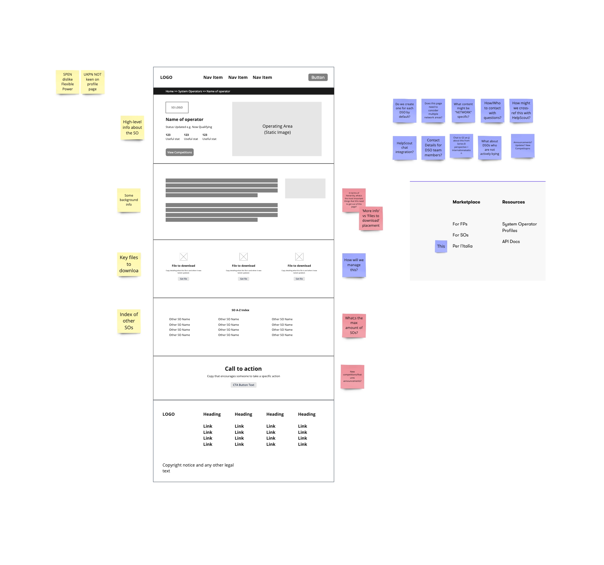
Early sketching
- Quick sketch in Miro, loosely considering existing design system elements.
- I did this immediately after starting the project just to start getting a sense for the shape it might take.
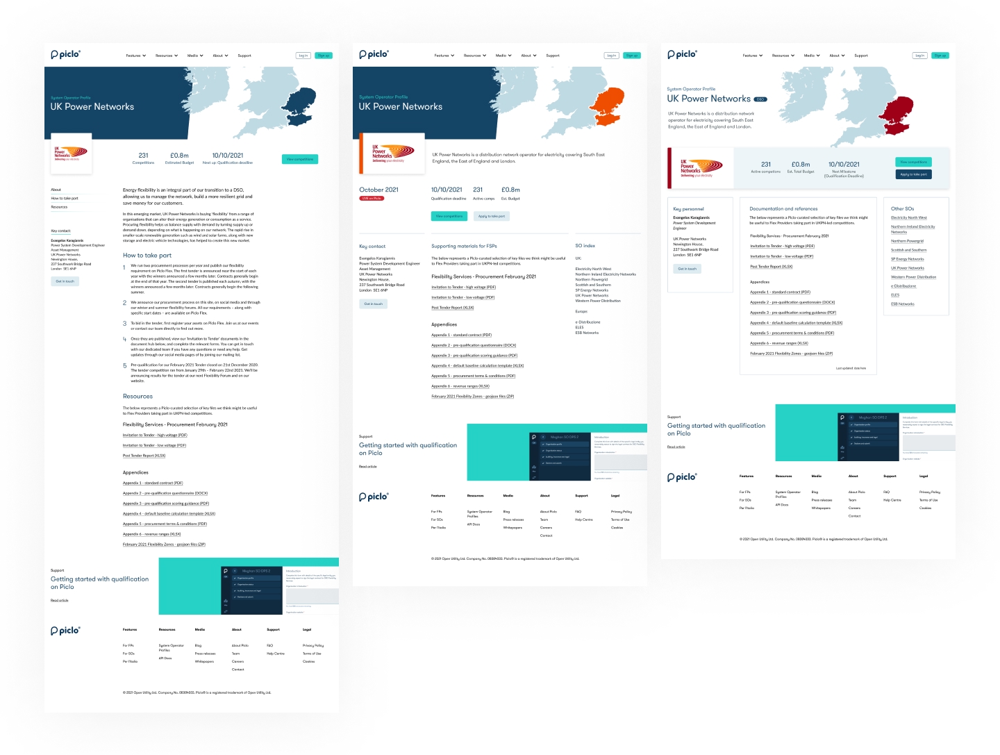
Mockup iterations
- Moved on to create several mockup iterations (not all of which are shown).
- So as not to design in isolation, I was able to hi-jack some time on pre-arranged calls with external partners to get a little bit of feedback to help us zoom in what we felt their priorities might be.
- Internal colleagues were also invited to provide feedback.
- These leveraged pre-existing design language I had created as part of an earlier project.
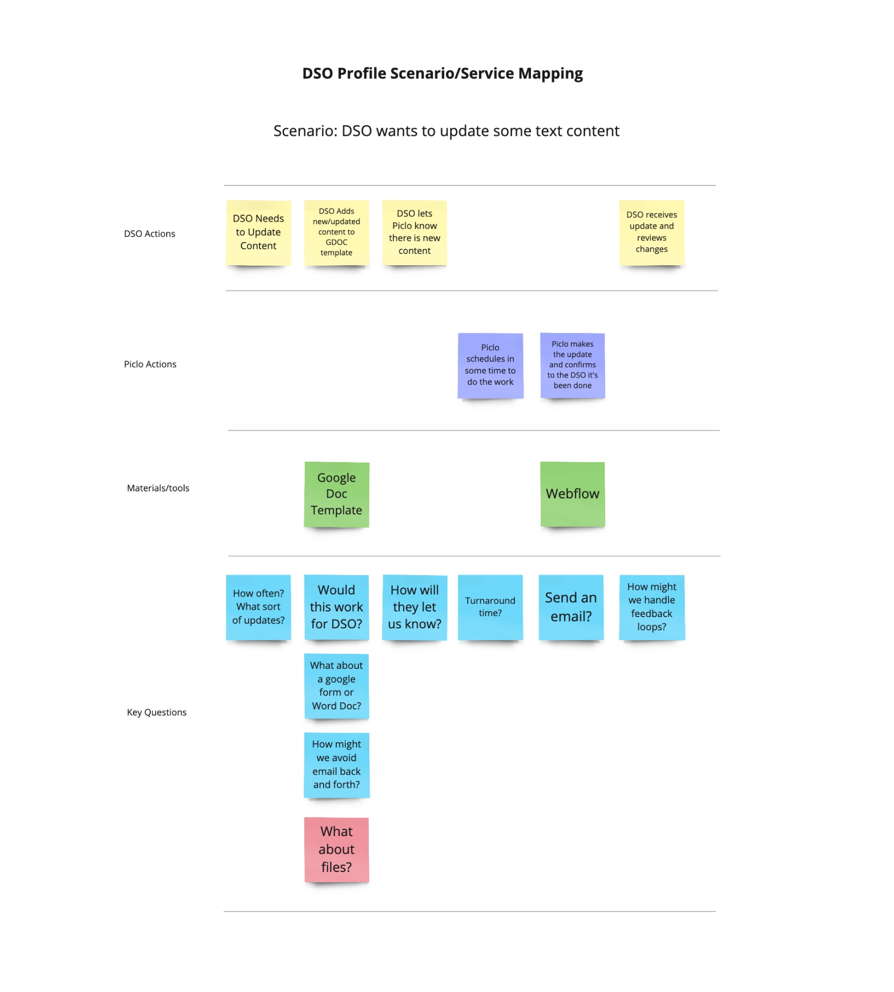
Simple scenario map
- I chose to walk Piclo's customer support team through a simple scenario in order to identify important questions and sanity check that we weren't creating a problem for ourselves.
- While very simple, this exercise helped shape some service terms we'd communicate to key customers at a later date.
- This also helped to identify what we could scope in or out early on. For example, we chose early on not to host files ourselves, but link directly to those files off-platform (something we'd later change).
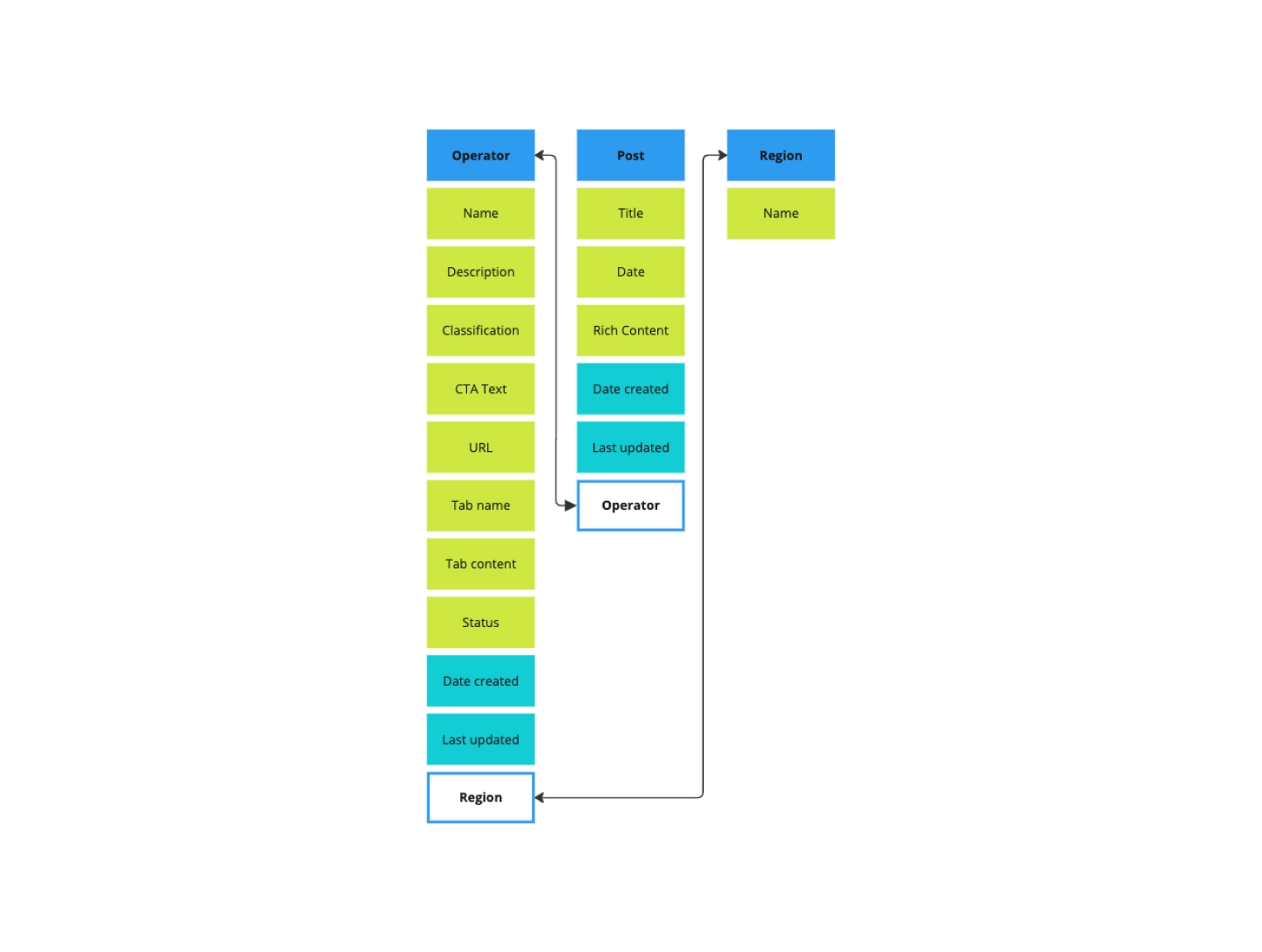
OOUX
- Object oriented UX techniques provide a great way to ground a project in the actual terms and mental models of users.
- I did this short exercise so I had some structure to work from when considering future mockup iterations and when building out the CMS components in Webflow.
- I opted to orient the solution around the "Operator" concept as this is typically how end-users saw things: they were offering their services to company X and wanted to find relevant information to that company.
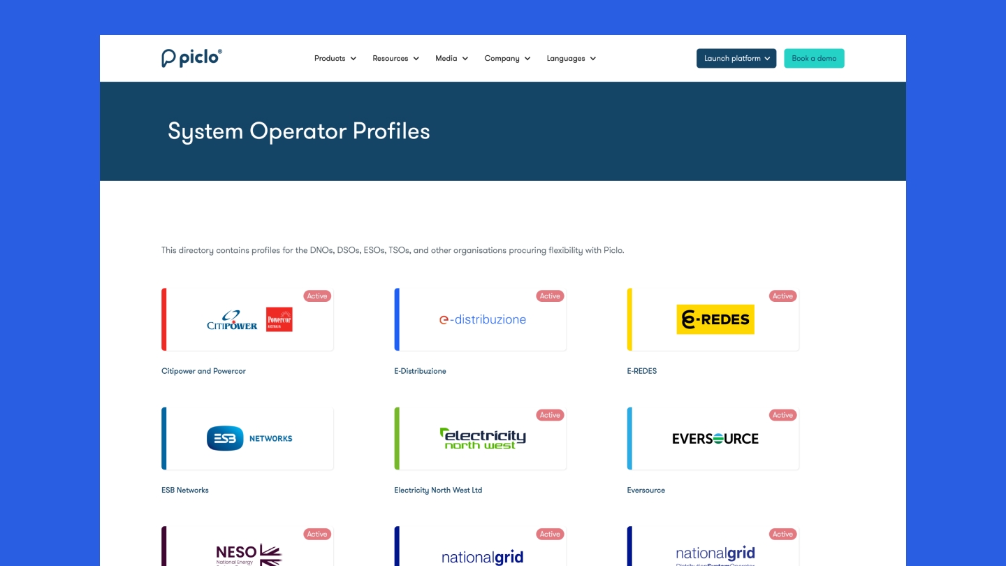
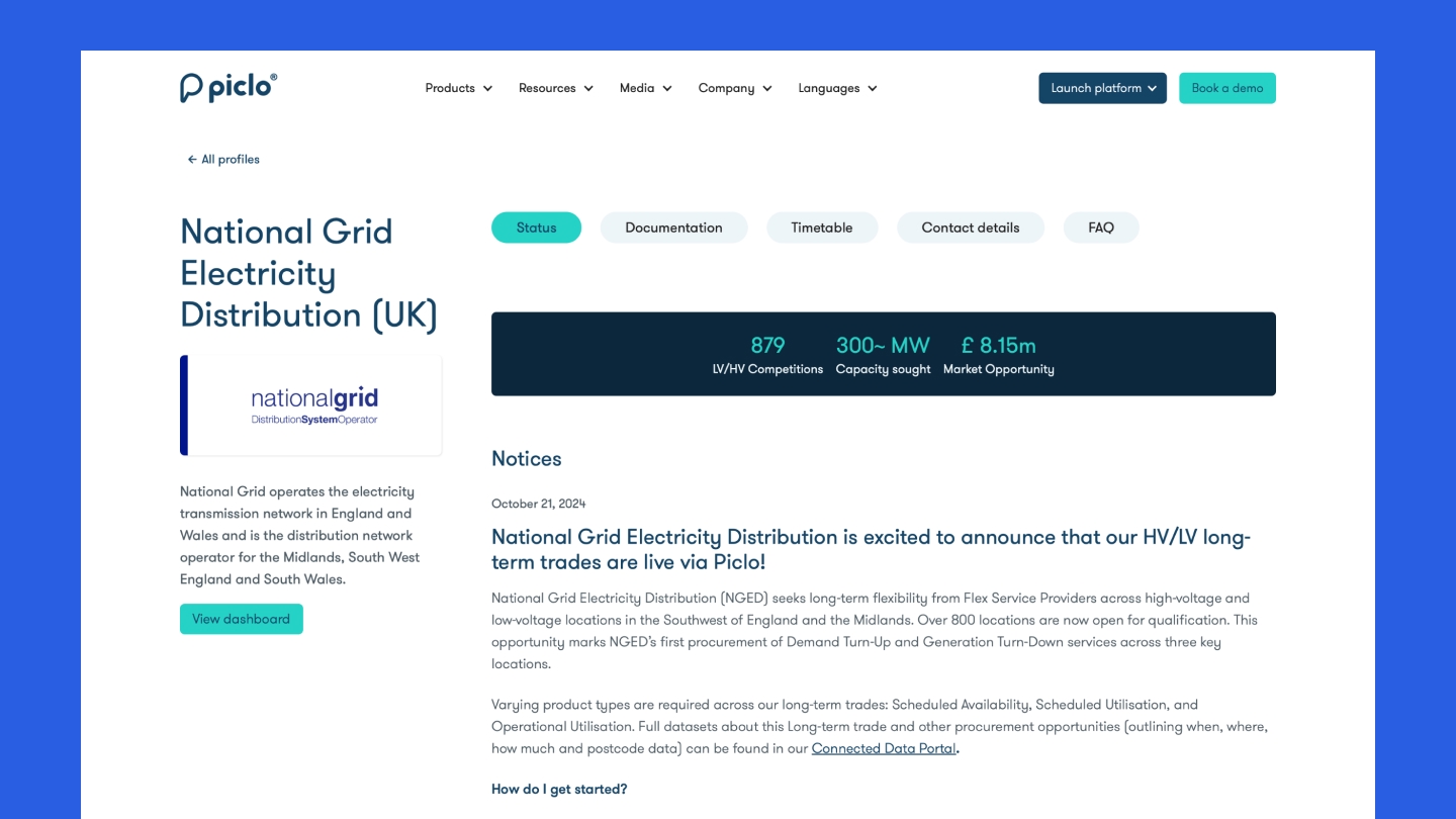
Final implemented solution
- After several quick-fire rounds of iteration and feedback received, time was running short, and so the final version lacked a few of the ideas proposed initially, but this was OK—I wanted to ship something of value at the end of the two week block. Enhancements and updates could come later.
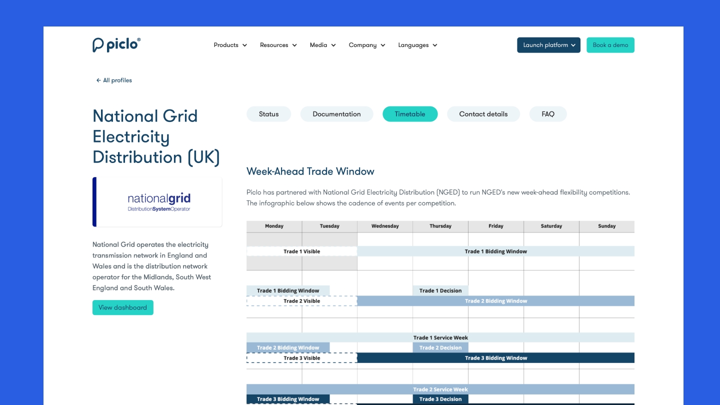
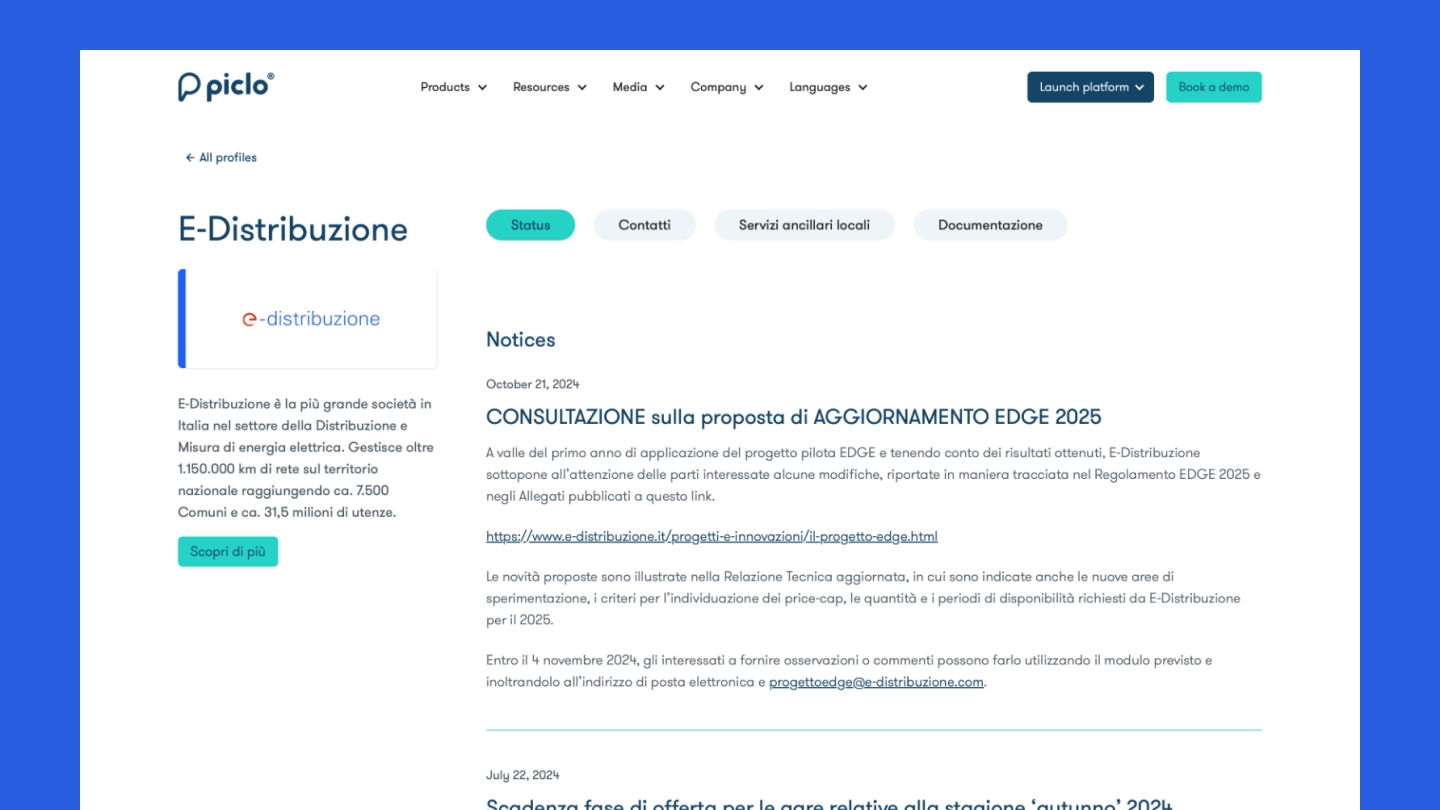
- The shipped solution included a directory page, sorted alphabetically initially, with room to add search or filtering later.
- Individual pages could be broken down in to customisable tabbed sections, with key stats and a post feed per market operator.
- Each tab could have complex content added, whether via HTML, Markdown, Rich Text or Image.
- You can see this live here.
Onboarding guide
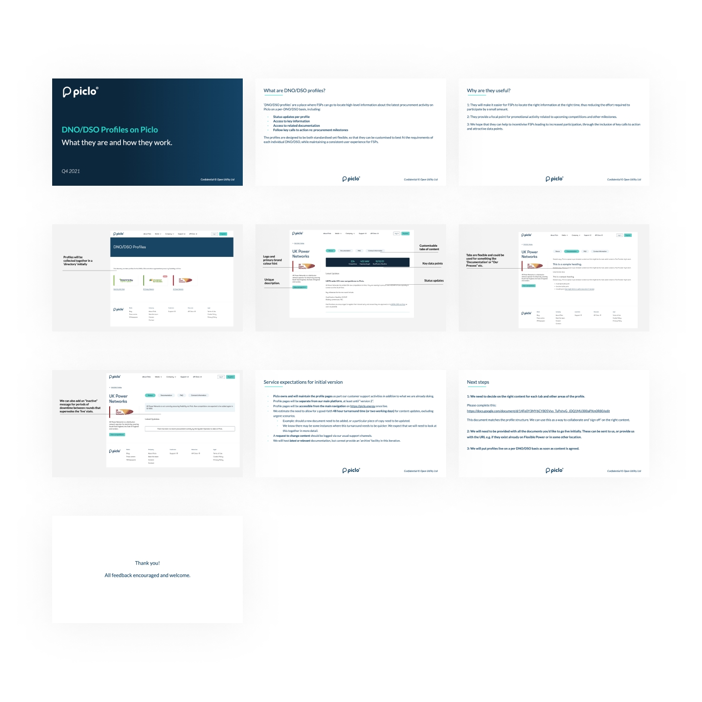
- Prior to shipping, I wanted to ensure alignement with all key stakeholders, so I put this brief guide together which I was able to use to walk external and internal colleagues through.
Training guide
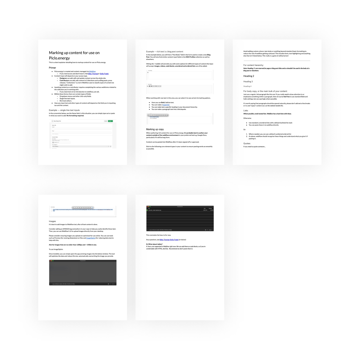
- Lastly, as other colleagues would need to help add and maintain content, I wrote a short tutorial detailing how to prepare and input content for use in Webflow.
- This wasn't strictly necessary, but helped reduce the need for technical input.
Notes for hiring managers
- Given the quick turn-around nature of this project, I moved through the gears fairly quickly and jumped in to building out a prototype fairly quickly, thus meaning there isn't a great deal of design process material to see here.
- I no longer have access to the Webflow account associated with this project and was unable to develop any visual material about the CMS implementation work.
- Validating success for this work relied very heavily on qualitative feedback gathered via customer support channels.
Thank you 🙏