Design Systems
Excavating the foundations of a design system
7 min read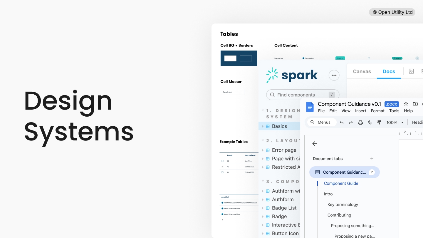
Summary
Across several project phases, I worked to create a foundational set of resources upon which Piclo could grow a practical and efficient design system, created to empower internal teams to work more efficiently, more consistently, and to a higher degree of quality.
Business goals
- Improve consistency of end-user experience
- Improve team productivity
- Unlock new value-add for end-users
Key design challenges
- Seeking buy-in and communicating the business case.
- Excavating and cataloguing existing UX resources.
- Identifying gaps and prioritising improvements.
- Productising the output.
My responsibilities
- Own the initiative, leading on best practice.
- Pull together existing knowledge and UX artefacts.
- Create foundational resources, including UI library.
- Identify opportunities for improvements, prioritising and sequencing as needed.
- Figure out how to best productise our output to ensure long-term success.
Problem space
Piclo didn't yet have a formal design system. It's flagship app, Piclo Flex, was crafted by a small team working in close collaboration. However the business was expanding, and now had multiple product teams working on adding new features and improving existing ones simultaneously.
This created several challenges:
- It was difficult for colleagues in our expanding product teams to create new or improved experiences consistently, requiring a lot of reverse-engineering and sleuthing out what had been done elsewhere in the app.
- Knowledge wasn't centralised or organised, requiring lots of Q&A, slowing teams down.
- Adding new patterns was hard, leading to duplicated efforts and reduced efficiency.
It was decided that the moment had arrived to begin addressing the above.
Seeking buy-in and communicating the business case
If any business is going to spend time fleshing out a design system, the moment needs to be right. For Piclo, that moment had come, and despite instinctively knowing that maturing our design system would be valuable, I felt it important to consider two key things:
- Evidence of need: we wanted to ground our work in actual end-user needs, in this case, colleagues. Doing so would help identify where common pain points lived and where to prioritise initial actions. It also helped to better understand the cost of inaction if we choose to do nothing.
- Understanding the impact: what might the impact on the team be should we choose to work on our design system now? How might this impact other work?
Evidence of need
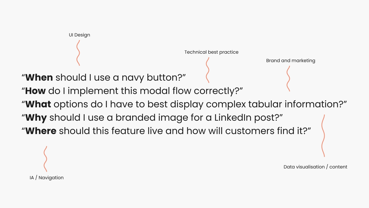
I spent time with design, engineering and product colleagues initially, to try and understand common questions arising when information was lacking and to uncover any other forms of friction holding teams back. Some common types of questions can be seen illustrated below.
It also felt important to consider the commonality of issues more generally — it seemed important to highlight that all teams were suffering to some degree.
Understanding the impact
With some simple but strong evidence to hand, we had validated that action was needed, but when might we begin to see the benefits?
Measuring this precisely is useful, but could take longer. I therefore opted to arrive at a general ballpark that could be communicated more quickly.
I chose to address this by illustrating two simple, but important ideas:
- There will be a lowering of productivity towards primary business goals in the short term, leading to longer term gains.
- However, by being selective with what we tackle first, we can reduce this short term pain to a minimum.
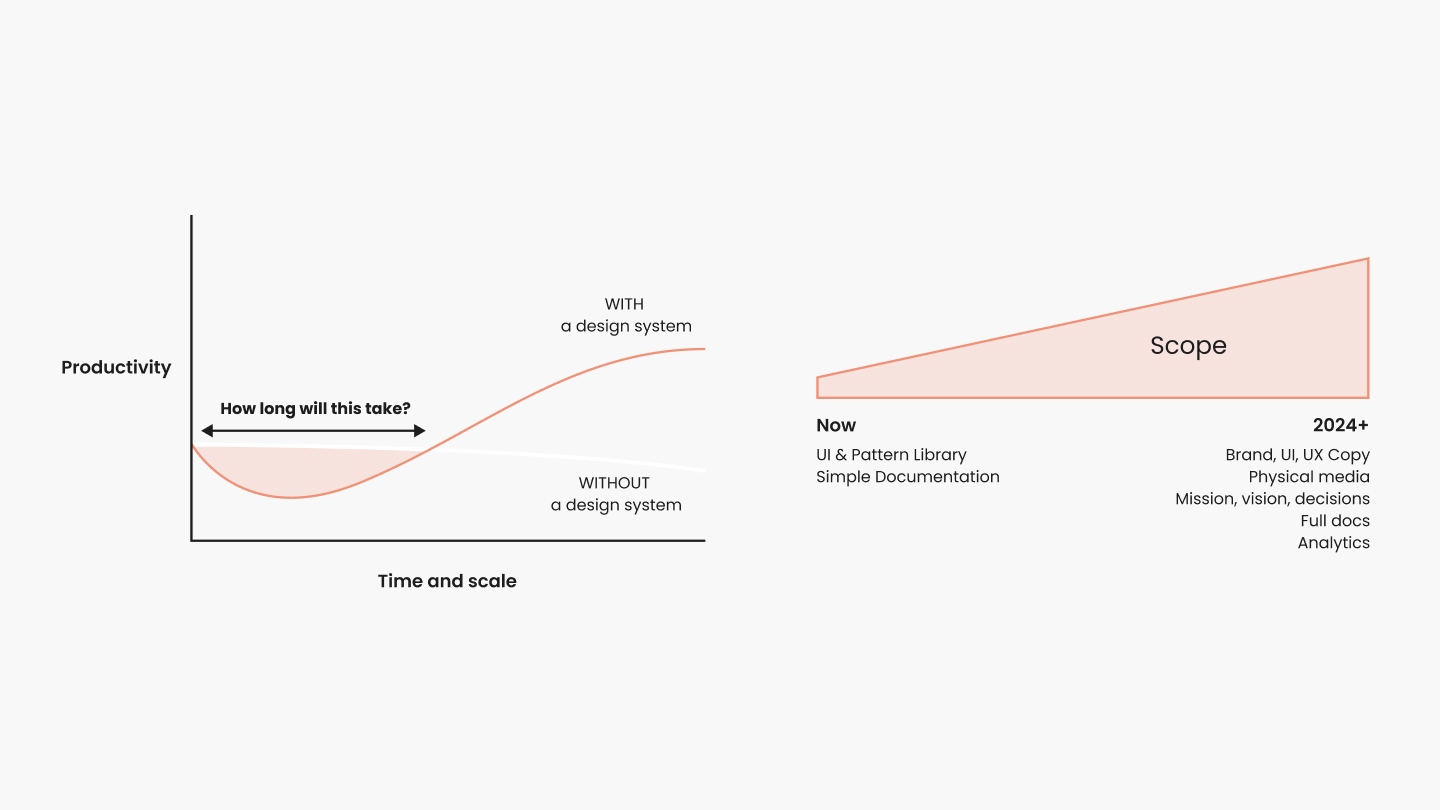
Using these ideas, and leveraging the evidence already gathered, I put together a business case deck to communicate everything with other stakeholders.
Ultimately decided that we would move forward with some quick wins.
Excavating and cataloging existing UX resources
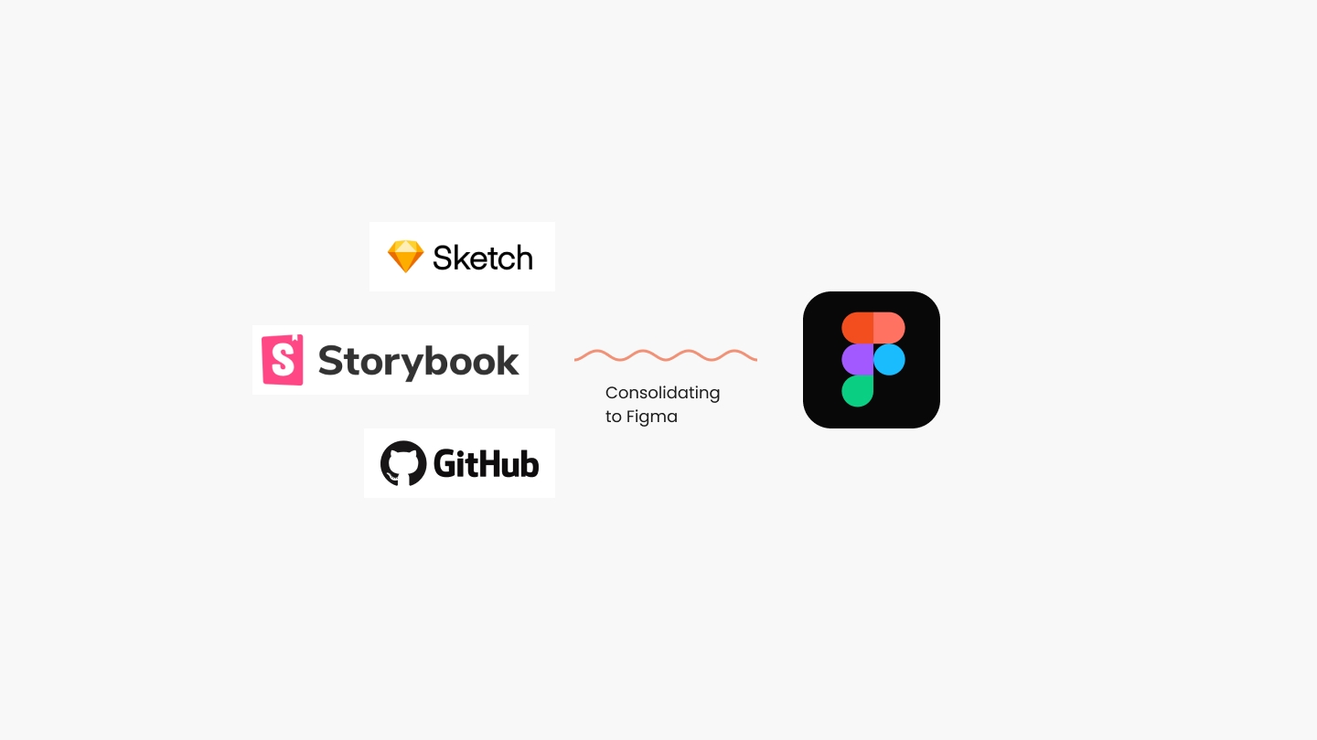
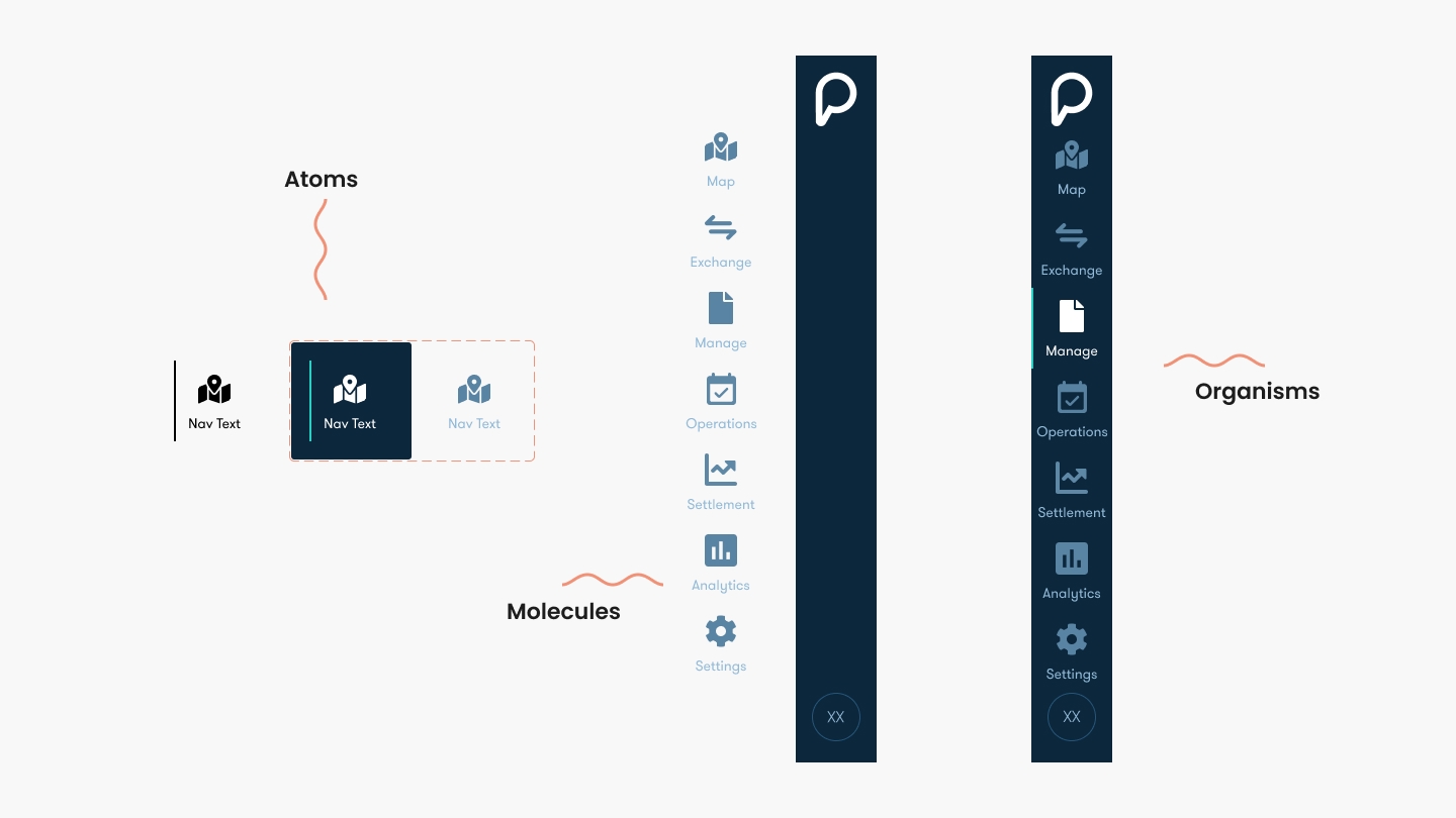
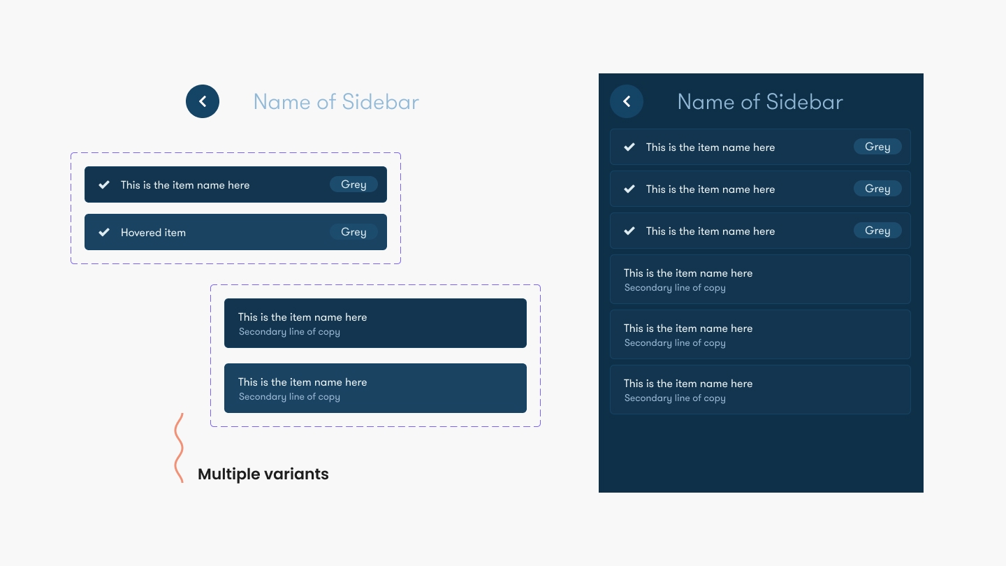
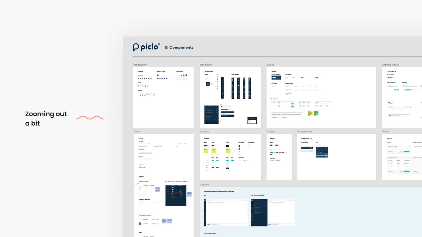
At Piclo, we didn't yet have a dedicated UI library in a designer-friendly context i.e. that could be used in mockups, prototypes or product design situations. Early app design work had been done in Sketch, yet the team had subsequently moved to Figma. The source of truth for our UI was best expressed in Storybook, yet was undocumented.
Anecdotally, laying design system foundations is a little bit like archeology.
You know a whole bunch of useful stuff exists below the surface, so you have to carefully excavate and catalogue what is there.
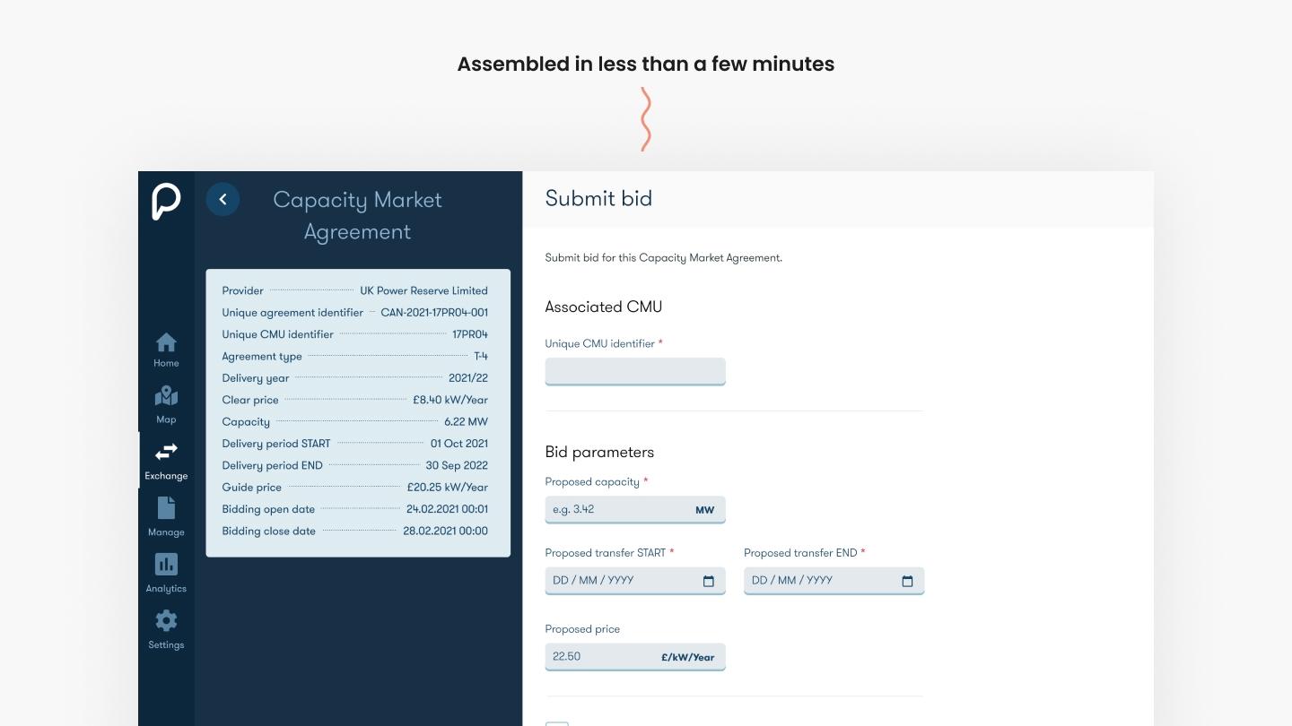
So, with fedora, whip (and spade) at the ready, I began putting together a scalable UI library for our growing design team to use.

Productising the output
With some of the basics in place, it felt like the right moment to consider how best to productise the design system.
By thinking of a design system as a product in and of itself, you can apply typical product-thinking. What does the roadmap look like? How will adoption be driven? What metrics can we look at to help measure success? How might others contribute? How will they access it?
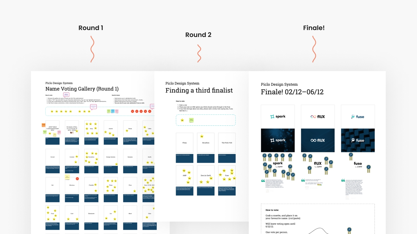
To get the ball rolling, I chose to focus initially on naming our design system. I ran a company-wide naming contest as a way to get everyone involved right from the start and to create a sense of co-ownership.
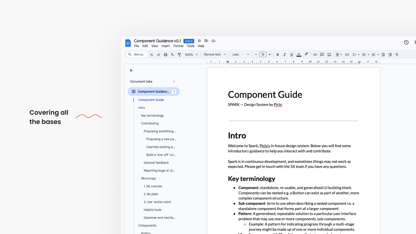
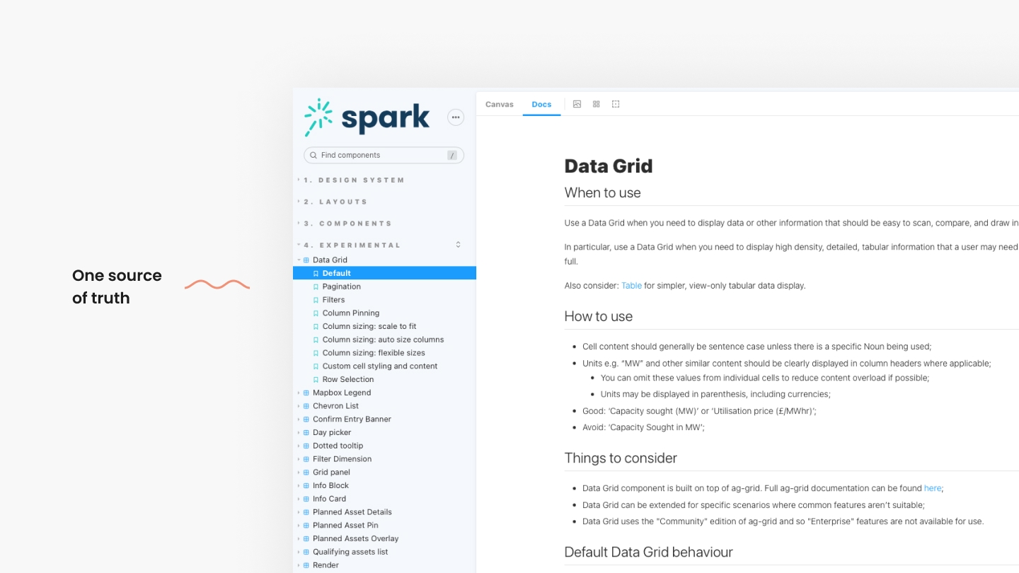
Next, I started centralising and publishing knowledge to the wider team, along with cross-pollinating this to other locations. Working with engineering colleagues, I was able to identify the most used components in our codebase so we leverage this data when making decisions about what to document first.
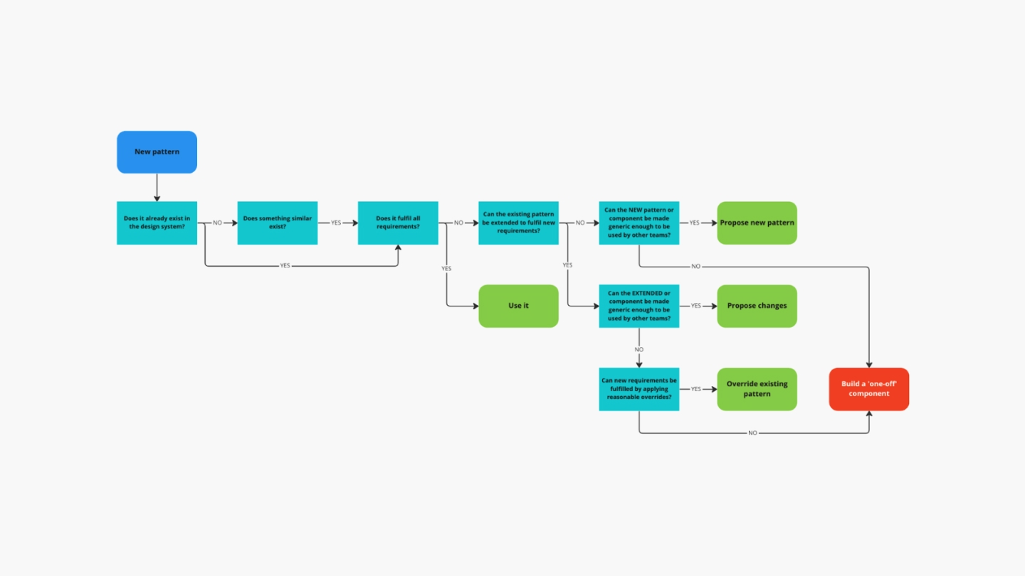
A key artefact I also chose to consider initially was to standardise a process for other product teams to use when deciding when to create a new pattern. This was done to reduce the risk of redundant work or accidentally having two teams try to solve the same problem. Ultimately, this was also done to help anyone know how best to contribute something
Identifying gaps and prioritising improvements
With some useful resources catalogued and in-use, I was now able to turn my attention towards the things we didn't find.
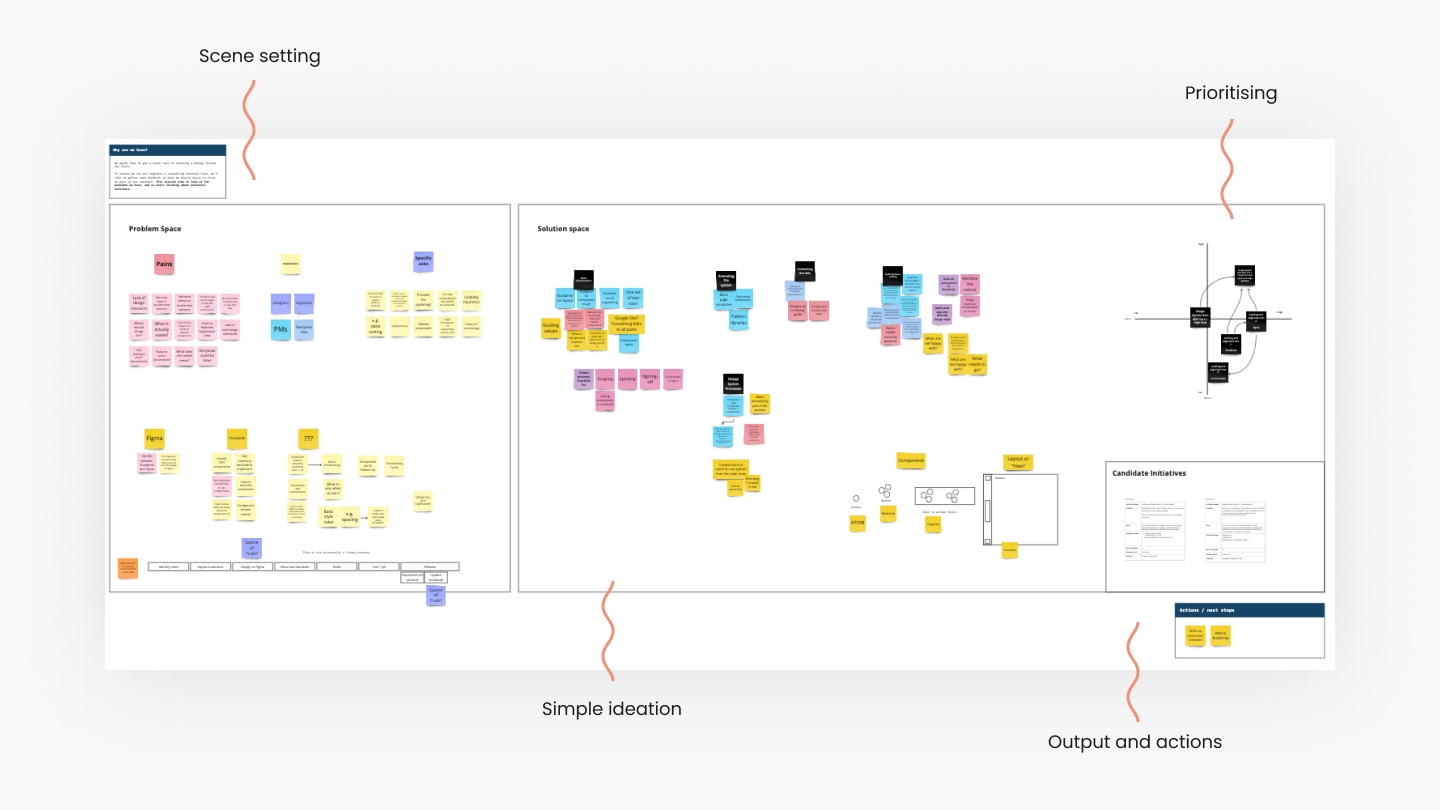
I organised additional short interviews with each of our internal product teams. I wanted to understand what challenges they were having crafting the right solutions for end-users. Where did they feel limited by the UI building blocks available? What wasn't working? What were we lacking that we could prioritised as something we could add? Were there any similar pain points being experienced by multiple teams?
The output of these conversations were collated in Miro, where I ran a short exercise with the team I was working with consider options.
After some simple ideation, estimating and prioritising, we landed on improving our data table UI, which I will detail in a separate case study.
Outcome
At this point, I had collaborated across the business to:
- Retroactively produce a UI library in Figma for product teams to use across the design life-cycle.
- Begun going through key components, writing documentation and drafting usage rules.
- Sync'd things back to Storybook to act as a source of true between designers, engineers and PMs.
- Begun the journey to full productisation of our design system, now named 'Spark'.
Candidates for next steps
- Continue to document individual components, end to end.
- Consider ways analytics could be used to help provide more data to help make smarter decisions.
- Understand how newly emerged technologies such as AI, LLMs and natural language interfaces could be leveraged to help make it easier to grow and wield the design system.
- Continue to invest in upgrades to key components and patterns to improve things for end-users.
Reflections
- A design system is a set of standards and accompanying resources intended to manage design at scale using reusable components and patterns. A (good) design system reduces redundancy while creating a shared language, with strong experiential consistency across all customer touchpoints. The work represented in this case study was focussed initially on product UI. A design system can and should be much broader in scope, encompassing brand, values, UI, marketing and more.
- Governance and maintenance of a design system is hard, and requires dedicated resource. For small businesses, this can be impractical, and so I'd recommend decentralising efforts as much as possible.
Notes for hiring managers
- In order to tell a coherent story, I've streamlined the sequencing of some of the work here. Not all of the work was completed in order as appears in this case study. In fact, the design system topic was picked up, then parked, several times over during my time at Piclo as other priorities came and went. Happy to dig in to this further in person.
Thank you 🙏