Improving the briefing process
Streamlining processes and making it easier for colleagues to initialise design briefs.

Preamble
Writing good design briefs can be very difficult. For projects with complex requirements, lots of stakeholders, and overlapping business goals, distilling everything down in to succinct, clearly structured stories or documents that everyone is aligned on can be a real challenge—something that’s always worth taking the time to get right.
Part of the job of being a designer is to help guide and facilitate this process. However, for smaller, more routine projects that recur often, it isn’t always necessary to be so hands-on, and so it’s reasonable (in some environments) to have a standardised briefing format that non-design colleagues can submit for prioritisation as and when needed.
Over a 12 month period at TotallyMoney, the business went through a significant amount of organisational change, during which time the design team was under pressure to juggle a lot of different tasks. With lots of stakeholders needing to request time from the design team every week, it became apparent that the standard briefing process we were using wasn’t quite cutting it.
Role
As part of a squad of stakeholders from across the business, I worked towards helping to find a simple, light-on-admin way in which colleagues could provide a brief to a designer using existing tools, with a focus on collecting the minimum viable amount of information to help the team to estimate and assign a job.
Stakeholder concerns
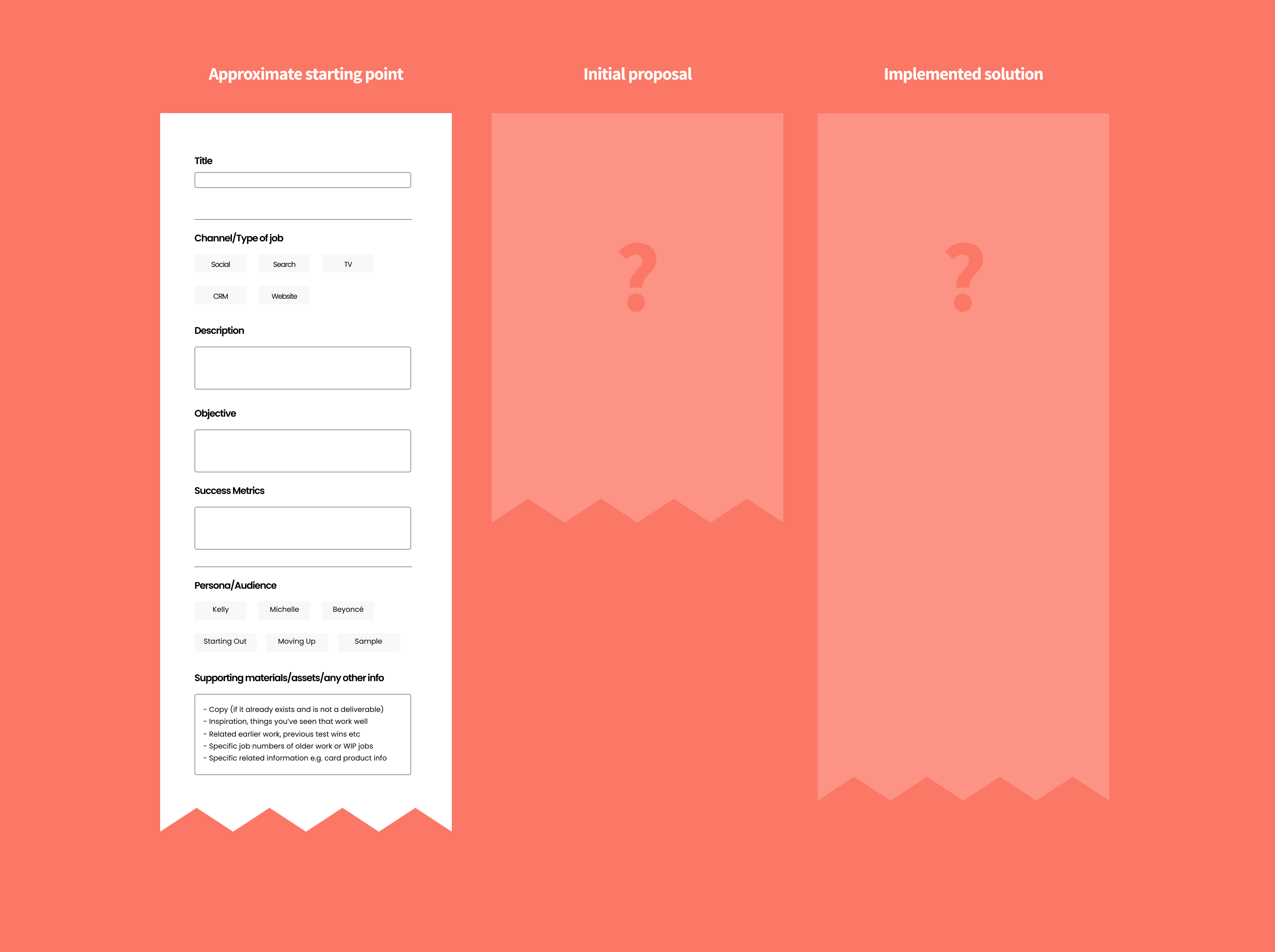
At the time, we were using a workflow management tool called Podio for all non-engineering tasks, which were handled separately in Jira. The workflow solution allowed colleagues to create a request for work to be done by the team that was then assigned and prioritised weekly in a planning session. Colleagues could create the request by completing a customised form within the app which would then create the job in the system. However, it wasn’t universally loved:
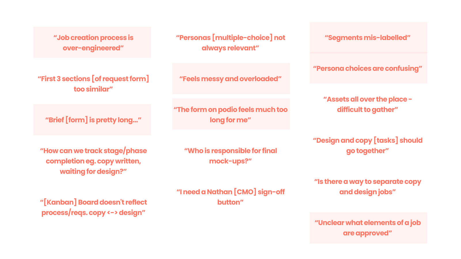
We gathered key stakeholders of the system together in meeting room and asked for feedback. As can be seen above, a few common issues emerged pretty quickly.
- The form was too long
- It wasn't clear enough what information was being asked for.
Introducing ’The Five Ws’
We needed a flexible, simple and robust way to frame the capturing of information. After a short period of research, we landed on an interpretation of 'The Five Ws'.
If you’re not familiar, The Five Ws are a set of basic, fundamental questions whose purpose is to draw out the minimum required information needed to help solve a problem. They are:
What (are we making/creating)?
Who (are we making it for)?
Where (will they see what we made)?
When (will they see it) ?
Why (are we making this)?
Example:
What — Animation for social media, with accompanying post messaging.
Who — Prospective customers with lower credit scores who are carrying a bit of existing debt and might want to learn how to reduce the amount they are paying in interest and which products are most suitable for their needs.
Where — Facebook and Instagram feeds, 95% mobile, 5% desktop split.
When — We aim to run the ad from the week commencing 3rd June. We know that the majority of traffic we get from Facebook happens fairly evenly throughout the day, with spikes around lunchtime and in the evening.
Why — We’ve got some sign-up data back from the product team that suggests a lot of people are creating an account and citing a need to transfer a balance on to a 0% card. We’d like to try out a few ad variations with messaging focused around this subject to see if we can drive some additional sign-ups next month.
Solution
Taking cues from The Five Ws, we initially proposed a very simple overhaul, whereby we cut the input form down to just three key sections.
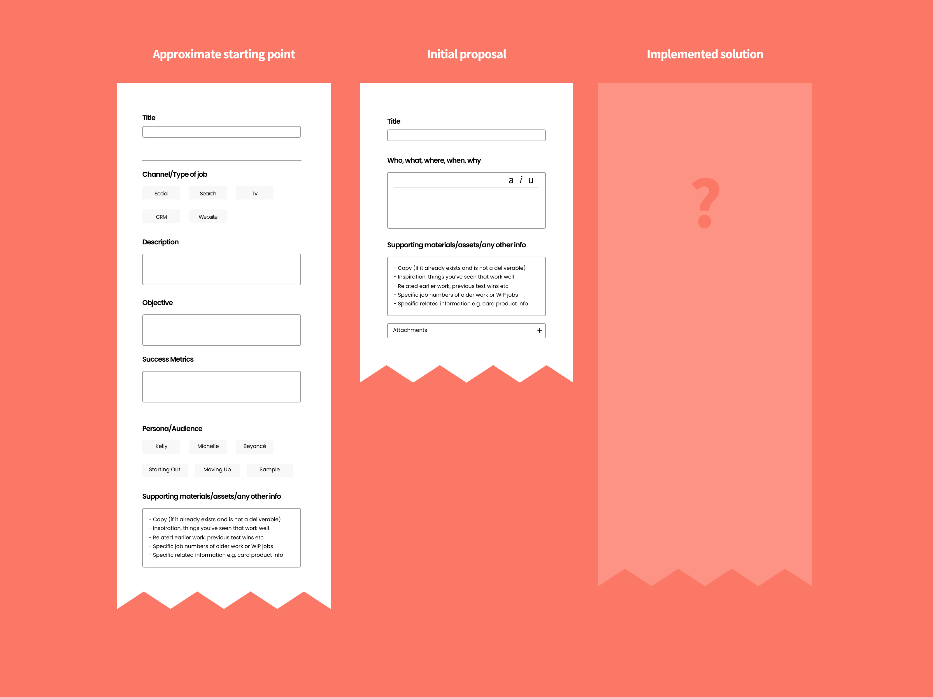
This was initially met with relief, as it felt very clear, and seemed like it was less of a chore to complete. However, opting for something so paired back had it’s downsides.
All jobs entered in to the system like this would lack any way to sift or classify them beyond a date and time, and so rather than roll all of the five questions in to one text input box, they were split out in to separate inputs. By doing this, we had kept the framing of each question intact, but created an extra bit of granularity allowing for cleaner workflows down the line.
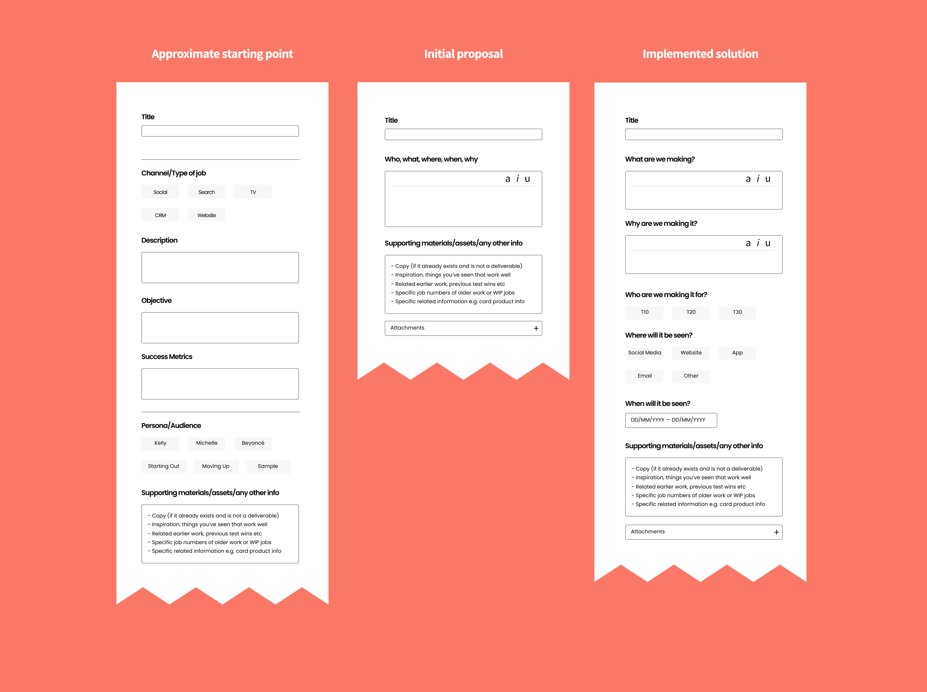
This was a very small piece of work, that didn’t take up too much time, yet had a positive impact on the quality of life of colleagues who needed to submit requests for work to the design team on a regular basis, and also ensured that each smaller project was initialised consistently, with a well-framed set of core information.