A11y
Designing an approach to get to AA accessibility
6 min read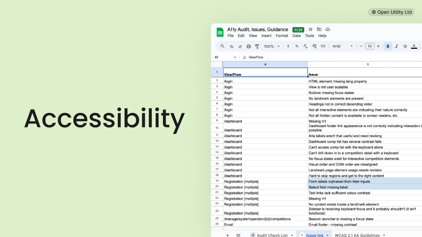
What
Over a 6 month period, I worked both individually, and as part of a small cross-functional team to audit and improve Piclo's flagship SaaS app, Piclo Flex, with the goal being to achieve 'AA' accessibility standards across the whole app, aligned to WCAG 2.1 accessibility guidelines.
Why
At Piclo, we hadn't yet formalised our approach to designing accessible digital services, and we didn't know how well we were doing (or not doing) across our ecosystem of customer touchpoints.
In addition, Piclo's SaaS product and business services were being procured by a UK public sector organisation. A key requirement of this process asked that we commit to ensuring our web app adhered to key accessibility standards, which we did.
This hard requirement acted as a catalyst to our desire to find out, see where we were falling short, and make improvements.
Role
- Become the thought-leader at Piclo on the topic of accessibility to help educate the wider team.
- Identify best practices, explore tooling options, and define what 'good accessibility' looks like for Piclo.
- Work with the team to classify, prioritise and triage issues discovered, workshopping potential solutions with the team using Miro and Figma.
- Write accessibility statement based on GOV.UK guidance.
- Ensure knowledge was shared and distributed.
Key contributions
Asking questions and identifying work themes
When considering this work initially, the team hadn't yet been fully formed, and so I chose to start by noting all of the questions I had.
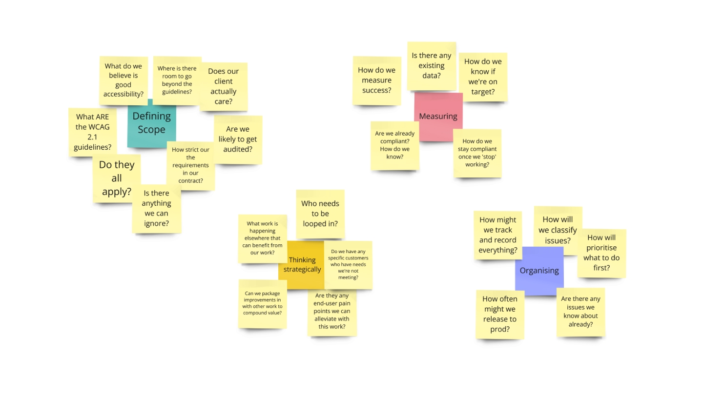
This proved valuable, as it helped to lay some ground-work ahead of others joining the project by providing loose structure.
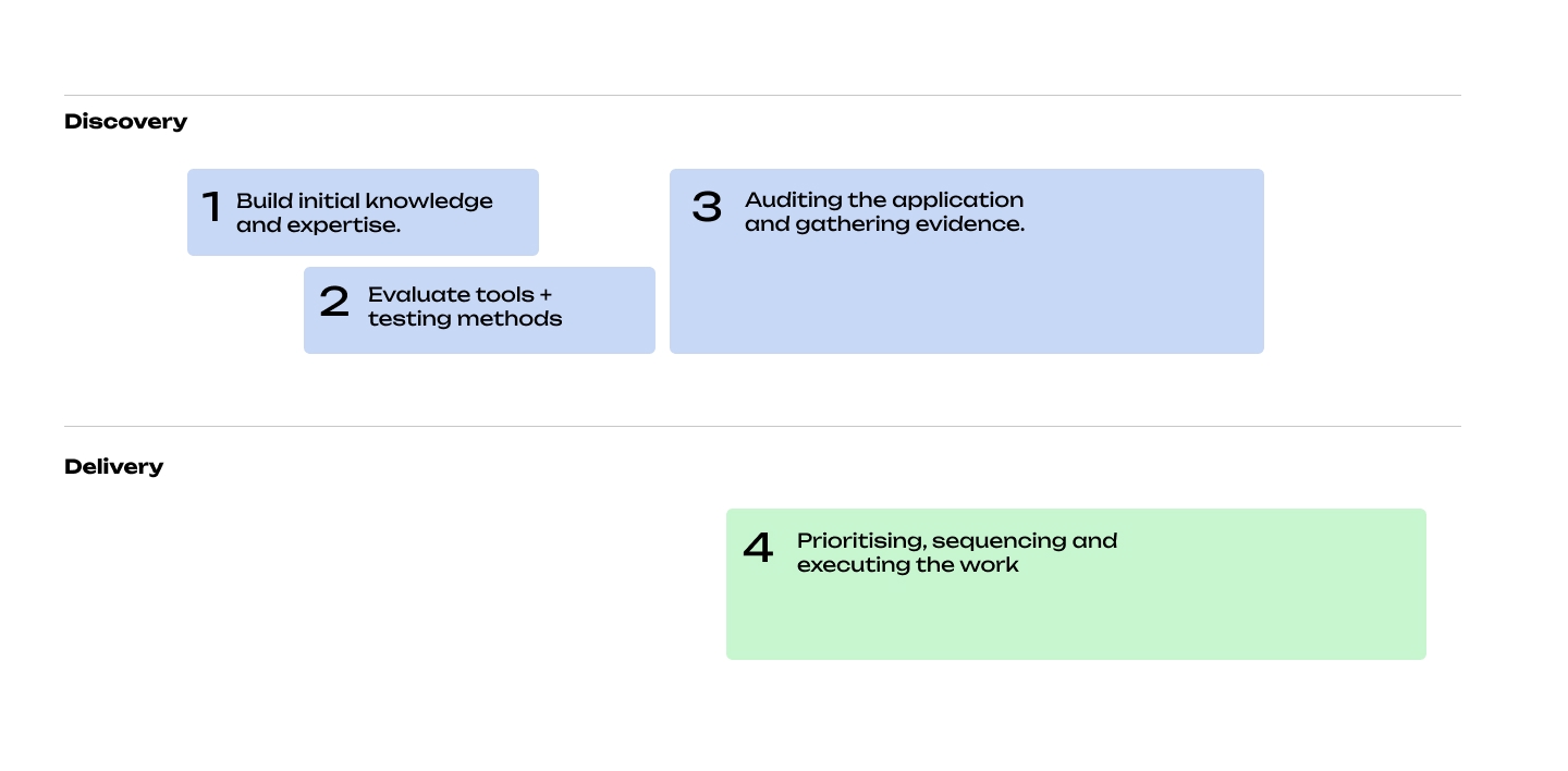
From the above, I was able to work with incoming colleagues to arrive at the following high-altitude project structure.
We'd spend a short period (not to scale below) figuring some things out based up initial questions, then we'd move in to a phase where we'd be both auditing and delivering solutions in parallel.
Defining some strategic principles
Alongside the above, I spent some time discussing the potential impact of the project with colleagues from across other Product teams to sound out any concerns and see who had some experience already.
From those conversations, as well as taking inspiration from several webinars and other sources of information, I wrote out some draft principles that would help guide our thinking.
| Principle | Description |
|---|---|
| Everyone is responsible. | We didn't want to fall in to the trap of making accessibility the problem of one specific team, we wanted the whole business to be pulling in the right direction. |
| Embedded | Accessibility isn't just something to test for at the end of the process before shipping, it should be embedded end to end in how we design solutions for users. |
| Continuous | Accessibility isn't something we stop thinking about when some target is met. Good standards, once achieved, need to be maintained and carried forward as our software and services evolve. |
| Non-disruptive | Achieving and maintaining standards will require extra effort, but we aim to minimise the impact on other teams who are focussed on other problems. |
| Imperative | Contractual obligations aside, poor accessibility standards is, in our case, bad for users, bad for business, and bad for the planet. |
Organising the work
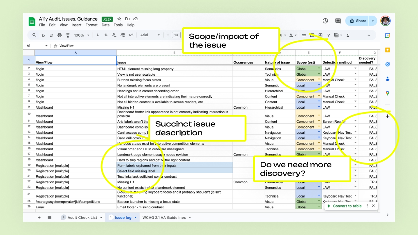
I made the choice early in the project to create a simple way to keep track of everything we were doing. I chose to use Google Sheets for this work, and my goal was to promote visibility of progress, transparency of process and provide links to any production tickets or other relevant materials.
This also proved to be a great resource to help onboard colleagues who joined the team, whether they were engineers or product managers.
The following details some key things I included to help us stay organised.
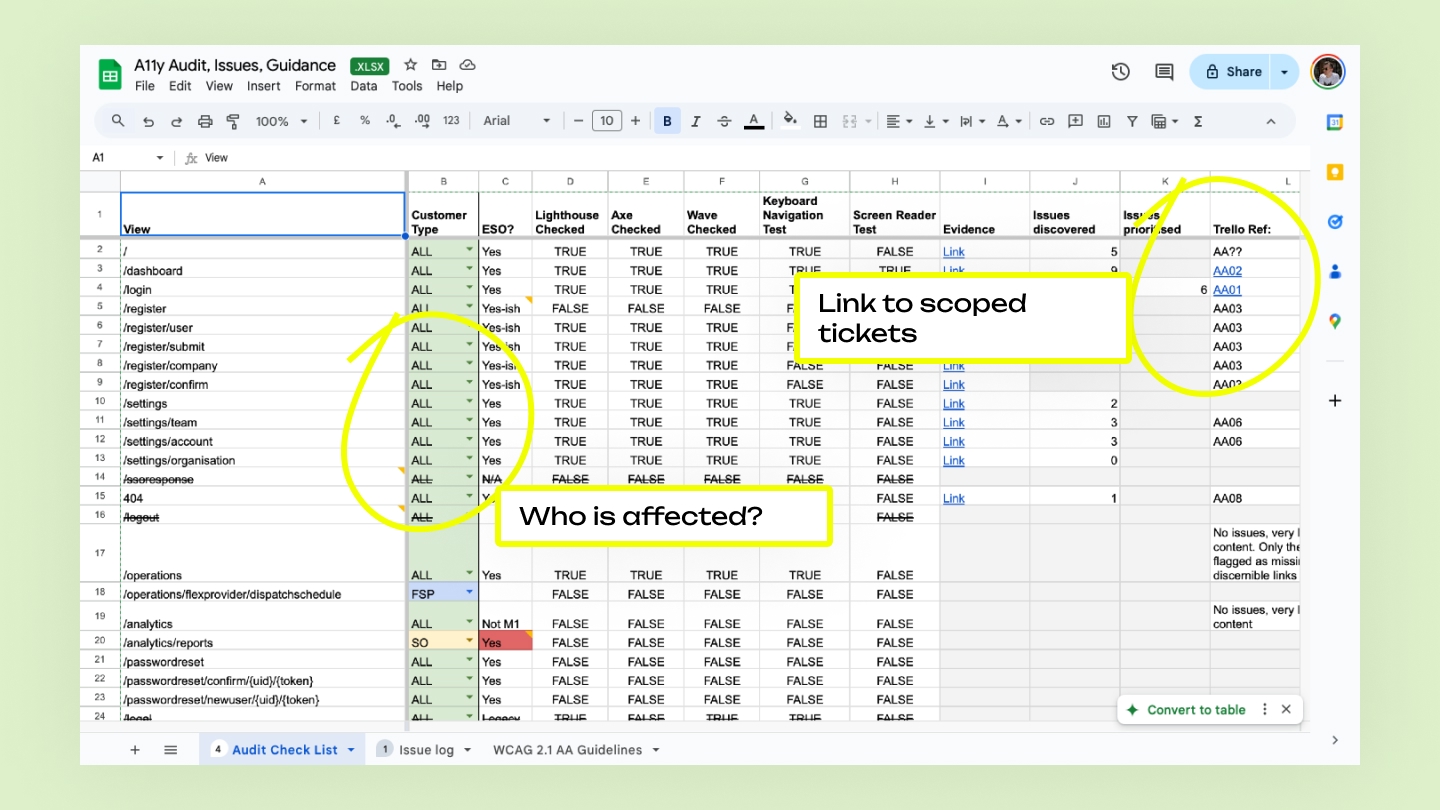
This resource evolved over time as our process improved and we added more tooling and built our own knowledge.
I also included a transcription of important WCAG 2.1 guidelines that were relevant to us, so colleagues could remain within the sheet when referencing things if needed.
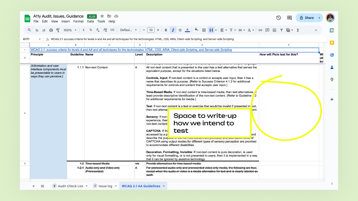
As you can see from the empty cell highlighted above, this last sheet wasn't entirely successful, as we documented our testing methodology elsewhere in the end.
Standardising ideation for efficiency
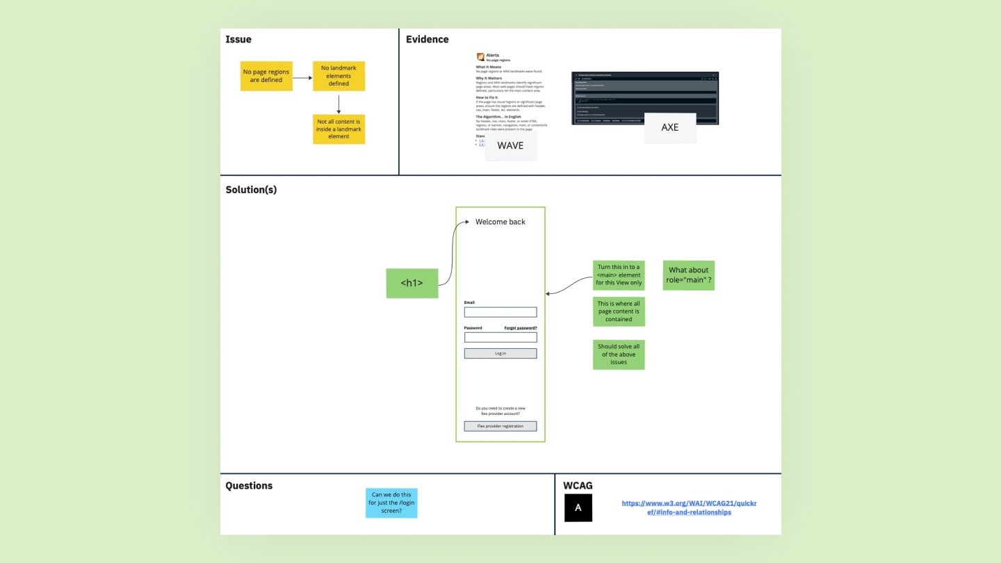
We used Miro as a place to gather visual evidence accumulated during our audit. I chose to create repeatable ideation canvases we could 'fill in te blanks' on to smoothly move through each issue consistently.
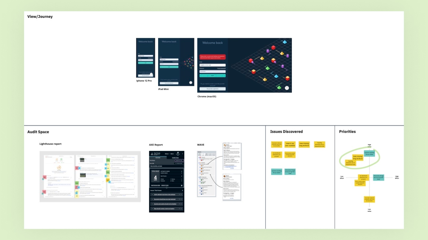
I created two types of canvas. One for looking across journeys in a more visual way, where we could log issues and attach our own notes and commentary as needed.
Secondly, I created a lower-level version that helped us focus on individual issues and ideate on solutions.
My aim was to make it as easy as possible for the team to fly through the work as smoothly as possible, with a good baseline of thought and time being afforded to each issue discovered.
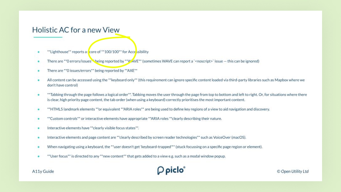
Codifying what good looks like
Towards the end of the project, we had built high confidence in our domain knowledge and working practices. Referring back to several of the principles highlighted earlier, I wanted to use part of our remaining time to decentralise that knowledge and onboarding other teams.
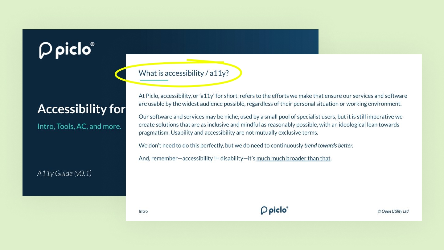
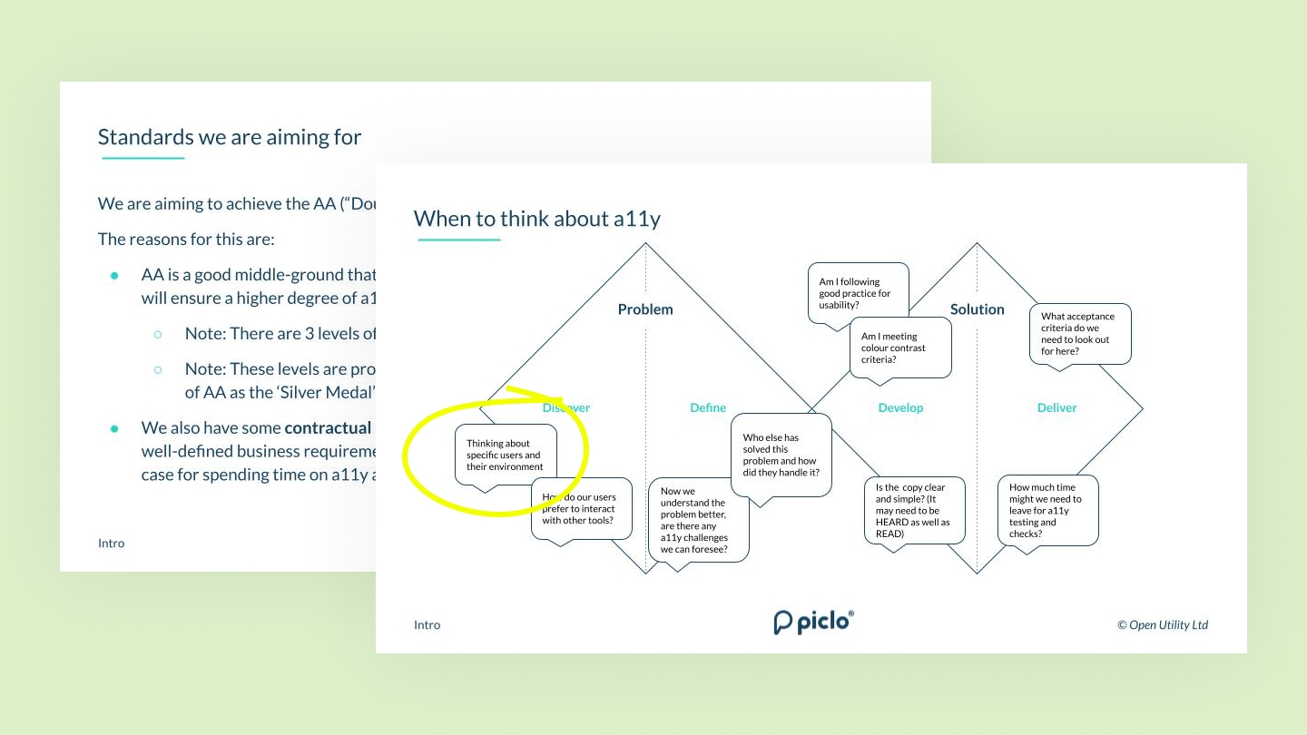
To aid this process, I created a serious of slides that walked teams through everything we had learned.
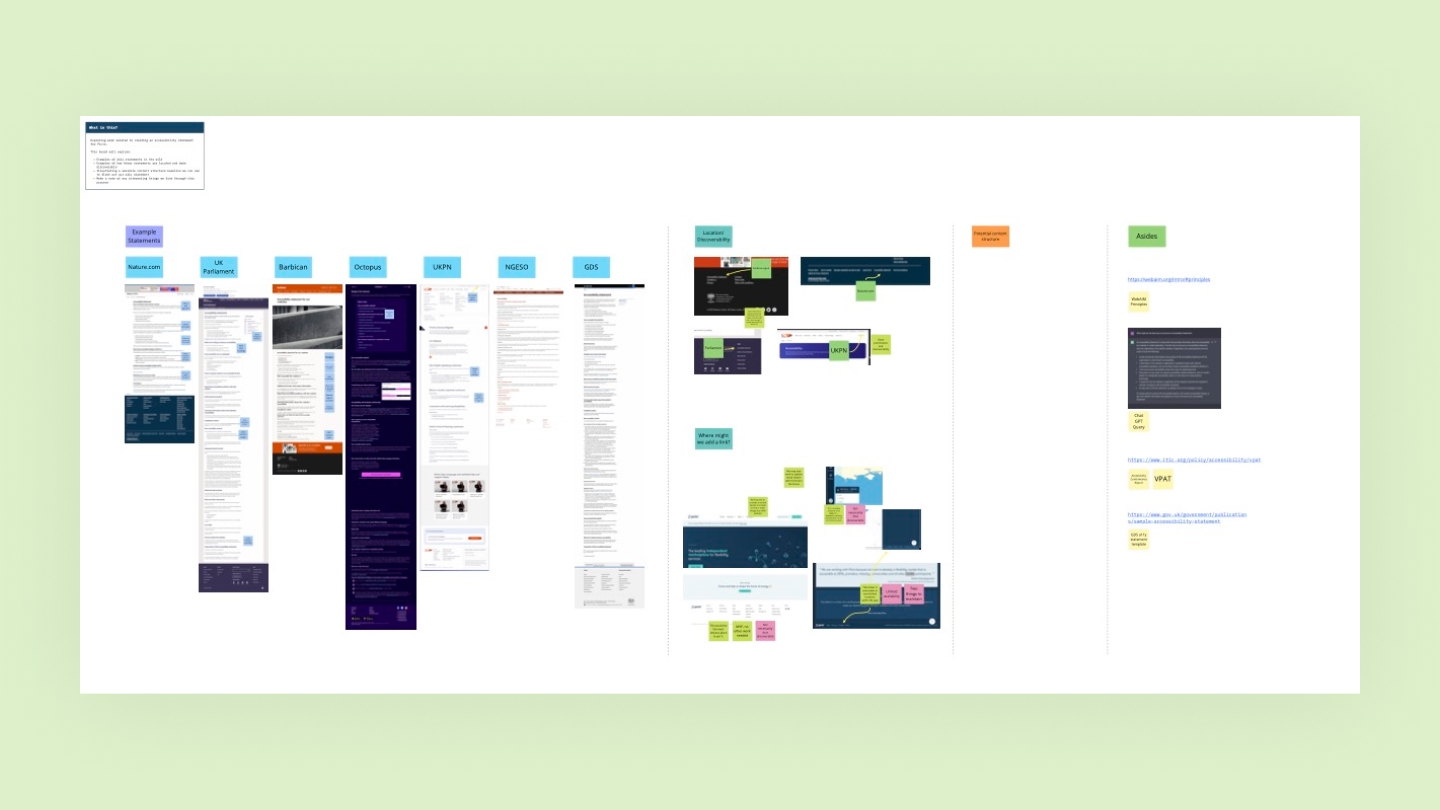
Lastly, I needed to write-up an accessibility statement. I conducted a short analysis of what other businesses were doing in this space to identify good practice and align with our own business needs. The latest version of his can be seen live here.
Wrap-up
What worked
- As a result of our robust and thorough processes, we were able to identify and deploy solutions to dozens of accessibility issues that in some cases took us to AAA compliance.
- Our team also had other projects and responsibilities to juggle, and we are able to target deploying a11y improvements alongside other strategically relevant work.
- I was able to help the business arrive at a set of processes that could help the team maintain standards with as little impact on existing workflows as possible.
- We met our contractual requirements.
- In some cases, solving accessibility issues led to more general improvements for all audiences.
Questions for the future
- How might we automate some of our testing processes so we become better at catching issues and reducing manual work?
- Going beyond technical... how might we asses the accessibility of our copywriting, content design, and anything else requiring a more qualitative measure of success?
- How might we continue to build an inclusive experience that will also, by it's nature, become more information and data rich?
Reflections
- There is no one-size fits all approach to creating accessible and inclusive services. Every organisation, and their respective audiences, will have different needs, depending on how they work, and functions of the service.
- Modern web applications are always evolving and are therefore a moving target, so any accessibility solutions deployed must account for things changing over time, and provide a means for teams to feed in to the process.
- Working at the component level was a great way to ensure improvements had widespread impact, and had the added benefit of maturing our design system as a result.
- Everyone wants to build inclusive services, but actually building the deeper levels of expertise needed to deliver on that is challenging and can require quite specialist knowledge. How could this be made easier for teams to digest and leverage in their own work?
Notes for hiring managers
- Accessibility and designing inclusive experiences requires a lot more work than just focussing on technical, easy to identify issues. While not explicitly called out above in this version of the case study, we chose to park-for-later work related to content design, copywriting and other fuzzier concerns as we had a pressing need to be able to quantify what we were doing.
- From a visual design perspective, we used plugins for Figma such as ABLE and STARK to help us achieve AA in terms of things like colour contrast well before most work even reached implementation stage.
Thank you 🙏